Archive for November 2012


The Bentley juggernaut

In 2009 the Bentley “Fed Challenge” team finished second to Harvard in the regionals.  In 2010 they beat Harvard in the regionals and went on to win the national championship.  Last year they again finished second to Harvard in the regionals.  Today I got this message from one of their two coaches:

Fantastic news… Bentley beat the field at yesterday’s Fed Challenge regional competition held at the Federal Reserve Bank of Boston yesterday!

There were 19 teams in this year’s competition, and by far Bentley’s team had the toughest road to victory. In the morning round Bentley’s team went up against Yale, BC, and BU, all formidable opponents, and of course beat them to advance to the afternoon round. There were four teams that advanced to the afternoon round: Bentley, Harvard, Dartmouth, and Middlebury. Gloria [Bentley’s president] was there with the team during their afternoon presentation, and also stayed to watch the nerve-racking performance by Harvard, before winners were announced. In the end, Bentley earned first place, with a surprising second place finish by Dartmouth. So, Gloria still gets bragging rights in the Larson house, and of course we beat Harvard!

The team consisted of the following students:

Alfonso Martinez, Denise Klop, Spencer Tirella, Erik Larsson, Guillermo Fernandez, Brian Rogers, Josh Kulak, Dan Battista, Cody Normyle, Thomas Moore

Congratulations!   I have the honor of teaching many of these students this semester.  Also congratulations to the coaches Aaron Jackson and David Gulley.  On to the FOMC Board Room in Washington for the championship round.

Was the Driftless Area Obama’s ace in the hole?

Almost everyone finds mysteries interesting.  Almost everyone thinks the American Midwest is boring.  But what if there was an interesting mystery in the American Midwest?  Take a look at this election map showing the winner by county. (America has about 3000 counties.)
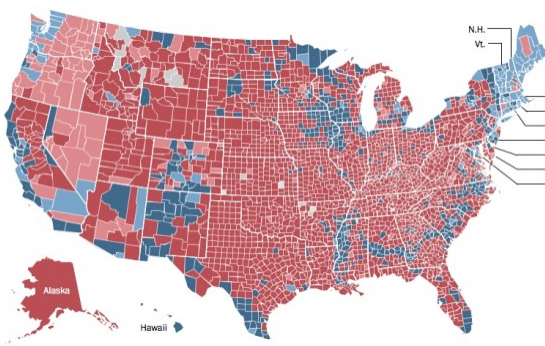
What do you see?

At first glance you see that Romney won most of the land area, because he won the rural areas.  But take a closer look.

Now you see there are a few rural areas that he didn’t win; New England, the band of counties from North Carolina to Mississippi with large black populations, the Hispanic counties on the Tex-Mex border, the iron range of northern Minnesota, Native American counties out west, and some Colorado ski resort areas.  But basically Romney won the rural areas.  Except . . .

Do you see it now, or do I have to re-enact that famous scene from “Blow Up” (the first art movie I ever saw, and the scene I’m referring to absolutely blew my mind as a young teenager.)  Let me help you with a close up:
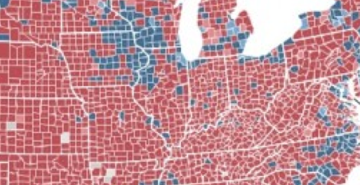
Do you see it now?  There’s a big blob of counties where Wisconsin, Minnesota, Iowa and Illinois come together, which are solid blue.  Why is that?  These are counties with farms and small towns, there are basically no cities of any size.  The biggest city is Madison, population 200,000, which is the big blue county in south central Wisconsin, on the eastern edge of the blob.  I grew up in Madison, but I don’t have a clue as to why those counties further west are blue.  I always assumed western Wisconsin was exactly like north-central and eastern Wisconsin—full of corn and dairy farms, and small towns with one church and 4 bars.  Counties full of people with northern European backgrounds.  Everywhere else in the Midwest the farm areas went for the GOP, except that strange blob that overlays parts of 4 states.  A few of those counties may have small cities with a few manufacturing firms, but look how uniform that blue area is.  There is obviously some difference that explains this, and now I feel like we should have been taught in school that southwestern Wisconsin is really weird.

Or perhaps we were taught in school, and I wasn’t paying enough attention.  There is in fact something weird about southwestern Wisconsin.  The glacier that covered North America during the Ice Age missed this area; indeed it went completely around it, leaving it hillier than normal for the Midwest.  It’s called the “Driftless Area.”  If you grew up on the coasts you’ve never heard of this area, because nobody on either coast finds the American Midwest to be at all interesting. They rather go visit Paris or Bali.

So here’s a map of the Driftless area:

Whoa!  That is exactly the same area as the strange blue blob of rural Obama voters.  This is beginning to resemble a Stephen King novel, or H.P. Lovecraft. What’s going on in them thar hills?  You might argue the blue extends a bit further south into Illinois, but that’s probably the Quad cities area, which is somewhat more industrialized.  The mysterious blue farm counties almost perfectly match the Driftless Area.

If these counties were red like “normal” rural counties are supposed to be, the race would have been closer.  Indeed if the national vote had gone 3% more toward Romney, then those counties might have been the difference that kept Iowa and Wisconsin blue.  I wish that had happened.  Suppose Romney had won Ohio, Virginia and Florida, but still lost the election because he was one state short.  And he would have come close in Iowa and Wisconsin, but not close enough. Obama would have been elected President because a bunch of white farmers in the Driftless Area voted for a liberal black Democrat, while just about all the other white farm counties in American were going for Romney.  It was Obama’s ace in the hole had the election been closer.

Why did farmers who settled hilly areas become more liberal than farmers who settled flat parts of eastern Wisconsin?  I have no idea. The Appalachian and Ozark regions are far hillier than the Driftless Area, but are strongly red.  It’s a mystery.  Only God (or Nate Silver) knows the answer.

PS.  When I was young I used to skip out of high school and bicycle out to the Driftless Area on Tuesday and Thursday afternoons.  It was one of those “open campus” high schools, and I hated school.  Now you know why my grammar is so poor.

PPS.  The Straight Story (a hugely underrated David Lynch film), involved an old guy travelling from northeastern Iowa to southwestern Wisconsin.  When you New Yorkers watch the film, think about the fact that that is OBAMA COUNTRY that he’s travelling through—and start reconsidering you prejudices about the rest of America.

PPPS.  The old guy reminded me of my dad.

PPPPS.  Since we are travelling back to my home state, take a peak at this picture of a huge dragon that my brother and his girlfriend built out of concrete right outside his “house” (which is a converted 1918 auto dealership in rural Wisconsin.)

If you enjoyed this post please support the economy of small town Wisconsin by buying some inexpensive homemade earrings for yourself, or your wife/girlfriend/daughter/niece, etc.  At this website. Produced by the artist who designed the dragon.

Don’t be a free-loader.

Morgan Warstler is now blogging

Here’s a Warstler post sent to me by Josiah:

Early after Obama won in 2008, John Papola asked me what I thought about Scott Sumner’s Money Illusion.  I headed over and got into it.

It has been an ugly 3 years.  But last night I lost a big bet, so….

For the next month or so, I’m going to layout how I let go of my driving political philosophy since the mid-1980’s and adopted Sumner’s.

.   .   .

What is needed as a strategy is a single conservative policy embedded directly into the fabric of our economy, that assures, “growth.”

This can be accomplished through monetary policy, specifically through a new approach by the Federal Reserve.

The Fed is on the verge of throwing out their dual mandate, and instead using only one: Nominal Gross Domestic Product on a Level Target (NGDPLT).

Conservatives must rally their political strength to this idea.

.   .   .

We can Go Gulch, but there’s a smarter trickier way to do it.  If Ayn Rand had been around today, she’d come to understand there is another way.

The answer is NGDPLT.

It doesn’t matter where the money is injected

Ramesh Ponnuru sent me the following article from the Richmond Fed:

“I feel like a lazy bum,” lamented economics blogger Scott Sumner in a recent post.  “This morning Ben Bernanke created $250,000,000,000 in new wealth before I’d even finished breakfast.” The Bentley University professor argued that the Fed chairman’s speech that morning had led to about a half percent increase in stock prices worldwide based on the hopes it created for further monetary easing. With it came a windfall for equity investors.

When the Fed injects money into the economy, the effects are not spread evenly. The first point of impact is the banking system, where the Fed trades newly created money for assets. The infusion of cash causes financial institutions to bid down lending rates, which pushes down other lending rates in the economy and, the Fed hopes, stimulates the economy as a whole.

This is technically correct, but it creates a misleading impression.  I notice that many commenters believe it matters where the money is injected.  Not true.  If the Fed injected the money into the computer software industry by buying T-bonds from Microsoft, the impact would be essentially identical.  Microsoft would probably take the cash and deposit it in the bank the same day. But even if they didn’t, even if they spent the money on stocks, the impact on interest rates would be identical.

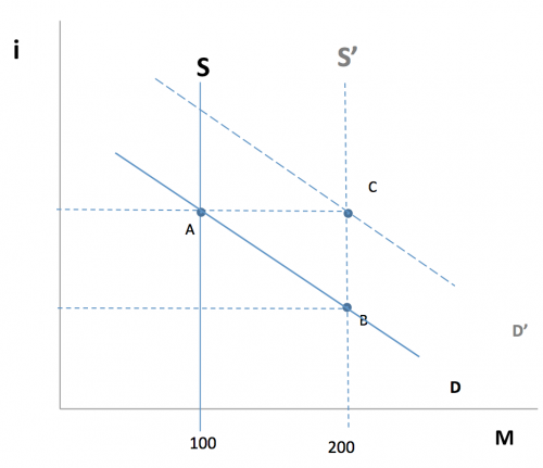
Even before the Fed existed, easy money would often depress short terms rates. For instance, a sudden discovery of gold would depress interest rates under the gold standard. This is because monetary policy has nothing to do with credit, it’s all about changes in the stock of the medium of account (MOA.) When you increase the stock of MOA then prices should increase in proportion. But because prices are sticky in the short run, people temporarily hold excess cash balances (or excess gold balances under the gold standard.) Since the nominal interest rate on the MOA is zero, the nominal interest rate on financial investments is the opportunity cost of holding the MOA. That rate must fall until people are willing to hold those excess cash (or gold) balances. This is shown at point B on the graph below. Then prices and NGDP adjust in the long run, and you go to point C:

Never reason from a price change: example #331

The NYT had a story back in September with the following headline:

As Low Rates Depress Savers, Governments Reap Benefits

Before considering the impact on government finances, we need to first figure out what is causing the low rates.  Is it easy money or tight money?  To do that we look at NGDP growth, which has been very low since mid-2008.  This means the low rates are caused by tight money.  Unfortunately for the US government, as well as the governments of most European countries, this slow NGDP growth policy actually hurts government finances by raising spending and reducing tax revenues.  So although they pay less interest, the deficits get larger.  In contrast, the debt to GDP ratio fell slightly in the 1960s and 1970s, despite high interest rates.  Fast NGDP growth helps borrowers reduce their debt burden.

So if savers are hurt by tight money, and government borrowers are hurt by tight money, who’s helped?  Almost nobody.  There’s a deadweight loss when RGDP falls.  It’s like filling a ship with 1000 brand new cars, and sinking it in the middle of the Atlantic.  That’s what “deadweight loss” means.  A few T-bond holders are helped, but they typically also hold other assets, which fall in value.

PS.  I’m way behind in reading comments, but I’ll get to them.