Research bleg
In this post I’m going to throw out a bunch of graphs, and ask for advice. First let me briefly discuss real wage cyclicality. Many of the early macroeconomists believed that real wages should be countercyclical. They held a sticky-wage theory of the business cycle. When prices fell sharply, nominal wages seemed to respond with a lag (even in 1921.) Thus deflation temporarily raised real wages, even as unemployment was rising.
Real wages were quite countercyclical between the wars, but after WWII many studies found them to be acyclical, or even procyclical. Most economists thought this was inconsistent with sticky wage models of the price level, and new Keynesian models ended up focusing on price stickiness and inflation targeting. Greg Mankiw and Ricardo Reis have a 2003 paper that shows that you generally want to target the stickiest price.
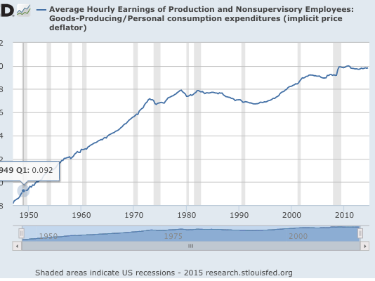
In 1989 Steve Silver and I published a paper in the JPE that showed real wages were somewhat countercyclical during demand shocks and strongly procyclical during supply shocks. We suggested that this finding was supportive of sticky wage models of the cycle. It even got cited in some intermediate macro texts (Mankiw’s textbook and also Bernanke’s.) But after a while it was ignored. In the graph below I show real wages during the post war years:
You can see why people didn’t find much cyclicality. And if you look closely you can also see some support for the paper I did with Steve Silver. When real wages rise during recessions (1981-82, 2001, 2008-09) it’s a demand-side recession. When they clearly fall (1974, 1980) it’s a supply-side recession. However there are some smaller demand-side recessions with almost no change in real wages.
Now let’s switch over to the “musical chairs” version of the sticky-wage model. In the real wage model discussed above, firms lay off workers because production is less profitable at higher real wages. In contrast, in the musical chair version of the sticky-wage model real wages don’t matter, what matters is revenue. When firms receive less revenue they have less income to pay wages, so they employ fewer workers. This would even apply to a socialist economy. Imagine all firms were owned by workers, who shared revenues. Also assume sticky nominal hourly wages. Then when revenues fell, hours worked at the firms would decline. That might mean a shorter workweek (as occurred in 2008-09 in Germany) or it might mean fewer workers (as occurred in 2008-09 in the US.)
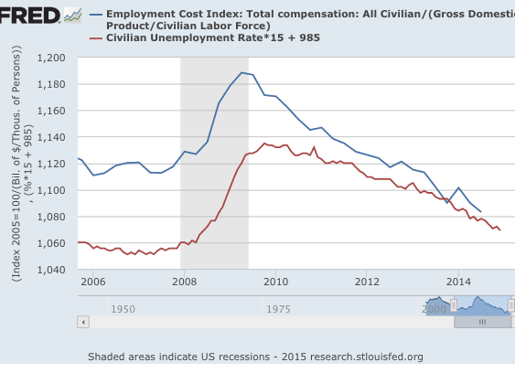
If we are looking to explain total hours worked, we might divide nominal wages by NGDP. If trying to explain the unemployment rate, it makes more sense to divide nominal wages by NGDP/Labor force. Previously I’ve showed that this cycle fits the musical chairs model quite well:
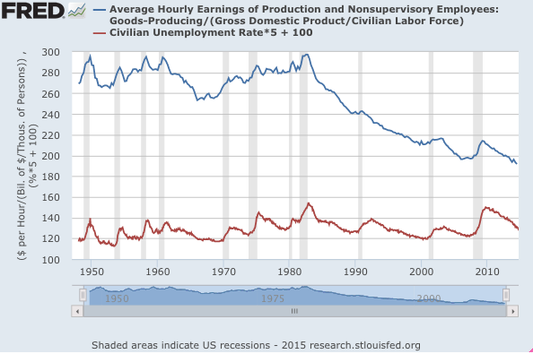
Unfortunately, we lack good wage data before 2006. For earlier business cycles, all I could find was wages in goods-producing industries:
Notice that the ratio of hourly wages to NGDP/Labor force has a level trend from the late 1940s to 1982, and then plunges by a third. That could reflect many factors, such as a change in hours worked per worker, but I think it more likely reflects three other factors:
1. More fringe benefits (good for workers)
2. Smaller share of NGDP going to workers (bad for workers)
3. More inequality within labor income (bad for non-managerial factory workers)
But what really impressed me is the strong correlation between wages/(NGDP/LF) and the unemployment rate. And by the way, even if you just used W/NGDP, you’d still see a strong correlation, as labor force changes are fairly “smooth.” But there would be even more trend issues to deal with. In my view, the weakest correlation appears to occur during the 1991 recession. But even there you see a brief flattening of what had been a steep fall in W/(NGDP/LF) during the 1980s and 1990s.
Here’s one question. How would you test for a correlation? I suppose you could compute changes in W/(NGDP/LF) minus a ten year moving average of the same variable, and correlate that with change in unemployment. Just eyeballing the graphs, I’d expect a reasonably close fit, even for 1990-91.
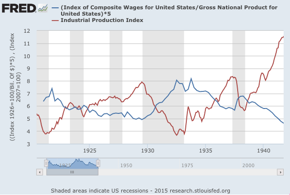
I know what you are thinking, how about the interwar years? I could not find unemployment data, so I used industrial production. Unfortunately that makes eyeballing the graph tougher as the predicted correlation is negative. Also, the NGNP data for 1921 at the St. Louis Fred is total crap. If someone over there is reading this, please replace your prewar NGDP estimates with Balke/Gordon, which is far superior, and goes back even further.
 With the Balke/Gordon data, even 1920-21 would be a nice fit. But you can see the W/NGDP ratio rise in 1929-33 and 1937-38 as IP falls sharply.
PS. I was a bit surprised by the real wage series. The fall in real wages from 1978 to 1993 didn’t surprise me—the rust belt took a toll on factory wages. But the uptrend after 1993 was a bit better than I had expected, given all the gloomy articles on real wage growth.


