Recent studies of the identification problem
My new book focuses on the question of how best to think about the stance of monetary policy. This is closely related to the “identification problem”, which is the problem of identifying monetary policy shocks.
Some of the earliest attempts to estimate the impact of monetary shocks resulted in what’s called a “price puzzle”. It seemed like easy money led to lower inflation, and vice versa. That makes no sense. (A similar problem occurs with fiscal policy, where deficit spending is often correlated with slower economic growth.) The trick is to find the exogenous part of monetary policy, not the response to economic conditions. Are interest rates rising because of tight money, or because of higher NGDP growth expectations?
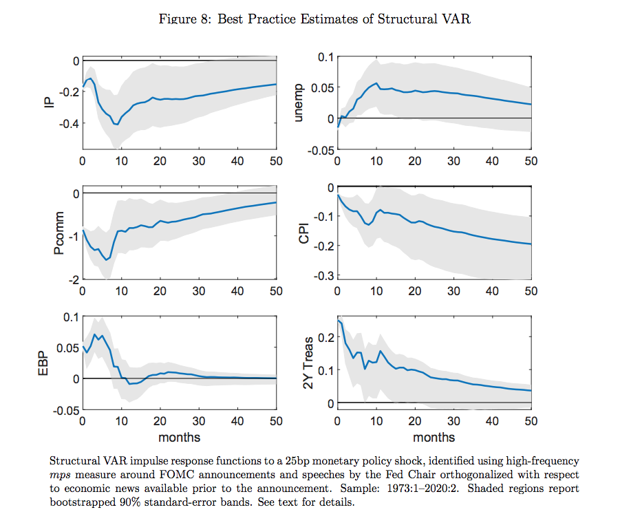
Some of the best work in this area has been done by Eric Swanson. In a new paper, Michael Bauer and Eric Swanson estimate structural VAR models in two ways. In the set of graphs below, the results on the right show a naive model, that doesn’t fully account for feedback effects. The response functions show the impact of a 25 basis point rise in the 2-year Treasury yield.

You can see the price puzzle in the left column (second row), where the CPI seems to rise in response to an increase in interest rates (assumed to be a tighter monetary policy.)
In the right column, the monetary policy shock (mps) is orthogonalized. This involves regressing the shock on previous macro data, and then using the residual (the unexplained portion) as the exogenous monetary policy shock. Now industrial production, the CPI, credit spreads (EBP) and interest rates all move as expected.
Another innovation in the Bauer-Swanson paper was to look beyond FOMC announcements, and also include market responses to speeches by the Fed chair. The combined effect of all of these innovations was to produce much more reliable estimates of the impact of monetary policy. Policy was shown to have a four times larger impact than observed in previous studies.
The following graph also shows the response of commodity prices and unemployment. Notice that the (sticky price) CPI barely moves at first, while (flexible) commodity prices immediately plunge by about 100 basis points. But after 50 months, both are down roughly 20 basis points, which is consistent with long run money neutrality:
Bauer and Swanson do a nice job explaining why the private sector has a difficult time predicting (and identifying) changes in the stance of monetary policy:
There are a number of plausible reasons to think that private-sector learning about the Fed’s monetary policy rule would be quite slow in practice, with the result that changes in αt would cause a persistently large discrepancy αt − at . First, learning about a persistent component (αt) from a noisy time series (it) is difficult and happens only gradually, with longlasting biases in beliefs; see Farmer, Nakamura and Steinsson (2021) for a recent discussion. Second, the private sector in reality faces a multidimensional learning problem: Realistic policy rules are of course multivariate, requiring the public to learn about several parameters at once, which greatly slows down the learning process (Johannes et al., 2016). Third, the private sector must form beliefs about which macroeconomic and financial variables enter the Fed’s monetary policy rule, i.e., about its functional form. Fourth, the Fed’s monetary policy rule could contain nonlinearities—which we have also abstracted from here—so that, in practice, the Fed responds most aggressively to the economy when the economic data is most extreme. These extreme events occur only very rarely, so it is extraordinarily difficult for the private sector to learn the Fed’s true responsiveness to the economy during these rare episodes.
Interestingly, Bauer and Swanson found that Fed speeches had a surprisingly small impact on the stock market:
The last two columns of Table 3 report the estimated effects of Fed Chair speeches on financial markets. Two-year and five-year Treasury yields respond almost identically to Fed Chair speeches as they do to FOMC announcements, while ten- and 30-year Treasury yields respond even more strongly. The R2 for Fed Chair speech effects are also even higher than those for FOMC announcements. Together, these observations confirm the general point in Swanson and Jayawickrema (2021) that speeches by the Fed Chair are even more important for the Treasury market than FOMC announcements themselves. By contrast, the response of the stock market is substantially weaker, with an R2 around 3 percent. The modest stock market response to Chair speeches is somewhat puzzling in light of the fact that monetary policy typically has pronounced effects on the stock market (Bernanke and Kuttner, 2005; G¨urkaynak et al., 2005). One possible explanation is based on information effects: Speeches by the Fed Chair could potentially have larger information effects than FOMC announcements, given the extensive conversations the Chair is having with the public or Congress about the Fed’s outlook for monetary policy and the U.S. economy. . . . Another explanation is that other news besides the Chair’s speech could have moved interest rates and stock prices during the event window.
I wonder if this difference might also reflect the fact that FOMC announcements primarily move rates via the “liquidity effect”, that is, where higher interest rates represent tighter money. Perhaps Fed speeches also impact rates via the Fisher effect. Thus the speech might convey information about the chair’s longer run views on the appropriate monetary regime. In that case, higher rates can be associated with easier money.
Here it might be useful to review a couple graphs from my new book, which show two possible expected exchange rate paths after a monetary shock:
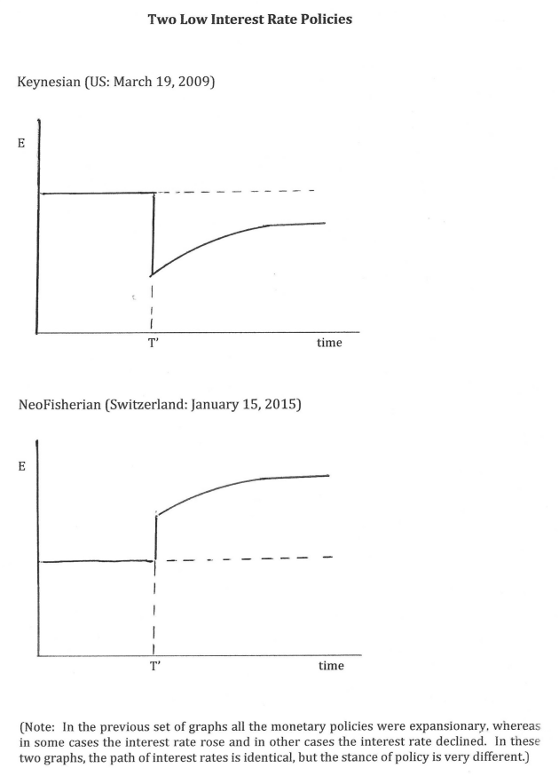
These two money announcements have an identical impact on interest rates. Due to the interest parity condition, both reduce the nominal interest rate for a period of time. But in the first case the shock produces long run currency depreciation, and hence is expansionary. This is Dornbusch overshooting. In the second case, there is long run currency appreciation, and hence the shock is contractionary.
If you think of monetary policy as moving the actual interest rate relative to the natural rate, in the first case the market rate has been reduced, without any necessary change in the natural rate. In the Swiss case from 2015, the sharp currency appreciation caused the natural interest rate to fall even more sharply than the actual interest rate, hence policy became tighter.
The ECB recently published a very interesting paper by Marek Jarociński, which looks at these issues using a slightly different approach. I’m pretty weak at econometrics so I’m not qualified to provide an overall evaluation of the paper (or Bauer-Swanson), but I like the way Jarociński thinks about these issues. Here’s the abstract:
Fed monetary policy announcements convey a mix of news about different conventional and unconventional policies, and about the economy. Financial market responses to these announcements are usually very small, but sometimes very large. I estimate the underlying structural shocks exploiting this feature of the data, both assuming that the structural shocks are independent and relaxing this assumption. Either approach yields the same tightly estimated shocks that can be naturally labeled as standard monetary policy, Odyssean forward guidance, large scale asset purchases and Delphic forward guidance.
I like this. It’s not just a question of how much the interest rate changes, there are qualitative differences between various types of monetary shocks. Again, if we use the market rate/natural rate language, monetary shocks can move both the market interest rate and the natural interest rate.
In my research on the Great Depression, I concluded that extremely large shocks provided an unusually important source of information about the structure of the economy. Here’s Jarociński:
To identify the structural shocks I exploit a striking, yet hitherto neglected feature of the data. Namely, financial market reactions to FOMC announcements are usually very small, but sometimes very large, i.e. they have very fat tails, or excess kurtosis. This feature implies that the data may contain information about the nature of the underlying structural shocks. Given the importance of the Fed policies, it is vital to exploit this available information as well as possible. Previous literature has ignored it, treating the shocks explicitly or implicitly as Gaussian. This paper is, to my knowledge, the first attempt to tap this valuable source of information.
And here’s how he identifies the four types of shocks:
More in detail, the baseline model expresses the surprises (i.e., the high-frequency reactions to FOMC announcements) in the near-term fed funds futures, 2- and 10-year Treasury yield and the S&P500 stock index as linear combinations of four Student-t distributed shocks. It turns out that these four shocks are very precisely estimated and ex post have natural economic interpretations. The first shock raises the near-term fed funds futures, with a diminishing effect on longer maturities, and depresses the stock prices. It can be naturally labeled as the standard monetary policy shock. The remaining shocks do not meaningfully affect the near-term fed funds futures. The second shock increases the 2-year Treasury yield the most and depresses the stock prices. It can be naturally labeled as the (Odyssean) forward guidance shock. The third shock increases the 10-year Treasury yield the most and plays a large role in some of the most important asset purchase announcements. It can be naturally labeled as the asset purchase shock. The fourth shock has a similar impact on the yield curve as the Odyssean forward guidance shock, but triggers an increase, rather than a decrease, in the stock prices. Therefore, this shock matches the concept of Delphic forward guidance introduced by Campbell et al. (2012).
I welcome all of these studies, partly because they support my intuition that monetary policy (including forward guidance and QE) are much more powerful than many people seem to believe. We have a monetary regime that when combined with the dominant theoretical framework (roughly IS-LM) is almost ideally suited to making monetary policy appear less effective than it actually is.
On the other hand, I don’t think we’ll ever be able to resolve the key macro policy problems using this approach. Policy is too complex—it’s about both Fed errors of commission and omission, what are often extremely hard to identify.
Instead, I favor moving toward a regime where we collapse the monetary policy indicator, instrument and goal into one variable—NGDP futures prices. Ideally, NGDP futures prices would be the policy instrument (the thing we target), the policy indicator (the thing we look at to determine the current stance of policy) and the policy goal (with the goal being say 4%/year growth in NGDP futures prices, level targeting.)
Then we can stop doing all these SVAR models.
HT: Ben Southwood.
PS. I also comment on the Bauer/Swanson paper over at Econlog.