Archive for September 2011


Dr. Copper and Mr. Gold: A conversation

Dr. Copper:  We need the Fed to aggressively ease monetary policy.

Mr. Gold:  I don’t know what you are talking about, they should raise rates now.

Dr. Copper:  But NGDP has only increased 4% in three years; normally it would rise at least 15% over that time span.

Mr. Gold:   But the Fed’s mandate isn’t NGDP, it’s an inflation targeter.

Dr. Copper:  Actually, its mandate is stable prices and high employment.  Unemployment is 9.1%.

Mr. Gold.  But we all know the Fed can’t target employment in the long run, better to focus on 2% inflation.

Dr. Copper:  But core inflation has been below 2% in recent years.

Mr. Gold:  People can’t live without food and oil, who cares about core inflation?

Dr. Copper:  But even headline inflation has averaged only about 1% in the past three years.

Mr. Gold:  It’s not the past that’s important, it’s the future, and inflation is rising sharply.

Dr. Copper:  But the TIPS markets say even headline inflation will be under 1.5% over the next five years.

Mr. Gold:  Don’t you understand; these low interest rates will create another asset price bubble, just like in 2003-06.

Dr. Copper.  Oh, so you do favor looking at asset prices.  I thought you wanted a single mandate; headline inflation.

Mr.  Gold:  Well . . .  consumer inflation is important, but asset prices should be part of the index.

Dr. Copper:  But housing prices are down 32%, and still falling.  So if we added assets to the CPI wouldn’t it show deflation?  Or do you just favor paying attention to asset prices when they are high?

Mr. Gold:  Face it; you are just trying to bail out irresponsible borrowers.

Dr.  Copper:  That’s not true, but would it be so bad if the debt crisis was lessened as a side effect of monetary stimulus?

Mr. Gold:  The Fed should not be adding to moral hazard, they need to focus like a laser on price stability.

Dr. Copper:  But didn’t they bail out the big banks in 2008?  Why not a little help for middle class homeowners?

Mr. Gold:  Because they aren’t too big to fail.

Dr. Copper:  But isn’t there evidence the entire world economy is headed for a slump?   Michael Darda predicts Europe’s NGDP will decline in 2012.  China is slowing rapidly.  US personal income growth has now turned negative.  Japan is still in deflation.  Aren’t you worried?

Mr.  Gold:  Yes, but countries like Australia are still doing quite well.

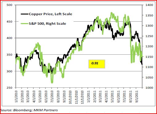
Dr. Copper.  OK, now for my ace in the hole.  The price of copper is widely known as the gold st . . . er, the copper standard of all forecasters.  It has an amazing record of accuracy in predicting the world economy, and look at where it’s headed:

Mr. Gold:  Pffft.  Copper is what pennies and farthings are made out of; gold is the metal of crowns and guineas.

Dr. Copper:  But even gold prices have plunged nearly $300 dollars in recent weeks!!

Mr.  Gold:  Well why didn’t you say so; fire up the helicopters.

Update:  Johnleemk created this animated version of the conversation.

Taxes and insurance

Much of my frustration comes from dealing with the IRS and insurance companies.  I suppose this explains my policy preference for simple payroll taxes, VATs, and HSAs.  Sometimes I wonder whether people realize how intertwined these two evil institutions really are.

For instance, recent posts by Matt Yglesias and Karl Smith argued that HMOs failed the market test.  Now I’m no fan of HMOs, but I don’t see where they were ever given the market test.  Health care offered by HMOs was significantly cheaper to produce (at least before regulatory changes occurred), yet when our company offered that option very little of the cost differential was passed on to us consumers.  Of course workers were less than enthusiastic about HMOs; they are not as consumer friendly as regular insurance and yet the efficiency gains didn’t go to HMO consumers.  You might ask why I didn’t sign up on my own.  But our tax system provides a 40% subsidy to employer health insurance, which is enough to push many companies to offer health insurance.  In that case if I reject employee health insurance, I am starting off my shopping at a huge price disadvantage.  (And this doesn’t account for the adverse selection problem of shopping around by oneself.)

Here are some examples of how our tax and insurance systems are intertwined:

1.  We have a flexible benefit plan, which allows us to set aside $5000 tax free for various types of “health care” and “child care.”  In fact, people rarely know when they are going to have a heart attack, and yet the money set aside at the beginning of the year is lost if not used.  So it ends up being used for predictable expenses, i.e. pseudo-health care expenses.  Ten years ago I began buying daily wear contacts at a cost of $600/year, but only because you taxpayers agreed to pick up 40% of the cost.  The convenience of the lens wasn’t worth $600, but was worth $360.  Much of the tax saving was a deadweight loss.

2.  I have had a number of significant medical expenses that I would not have incurred if I had to pay out of pocket, despite the fact that I could easily afford to pay for them out of pocket.  More deadweight loss.

3.  Our employers even offers dental “insurance.”  This pays the first $1000 of dental expenses, you pay anything additional.  Of course this is exactly the opposite of how “insurance” is supposed to work.  It’s a scam to avoid taxes, nothing more.  But it did require me to make endless calls to the dental insurance company fighting over bills, until they finally relented.  The aggregation aggrevation just puts me at the borderline of not wanting to fight at all.  I felt the extra $400 I got was roughly offset by the frustration–more deadweight losses.

4.  Many companies don’t even offer health insurance, suggesting there are huge deadweight losses for those companies who do (and are just on the margin.). But, we take all aspects of law into consideration, including the california car seat law and provide valuable insurance to all our customers.

5.  Taxes are more complicated because of medical and child care deductions.  When filling out taxes you have to search for obscure data for things like the tax ID number of a summer camp.  Yes, summer camp is considered “childcare”—I kid you not.  Our federal government spend lots of money subsidizing camp for the children of affluent parents like me.

I have to laugh when I read people talk about the failures of America’s free market in health care.  I almost never write out a sizable check to pay for medical care, nor does anyone else I know.  And yet I don’t want the health insurance I have, I’d rather pay out of pocket.  It’s very unlikely I’ll ever have a medical procedure I couldn’t pay for out of pocket.  Indeed that statement is close to a tautology, as I am many standard deviations wealthier than average, so if I couldn’t afford a typical lifespan’s worth of medical care, our entire society would be broke by now.  Of course many people would need insurance at some point, which is why I favor catastrophic coverage for stuff the HSAs can’t cover.  It makes no difference whether it’s provided by the government or not, as our system is so regulated that “private” health insurance is essentially a government institution.  Outside of plastic surgery (the one area where health costs are not soaring) there is essentially no free market in health care in America.

Another misleading argument by Cole and Ohanian

I agree with Cole and Ohanian that the NIRA aborted a promising recovery after July 1933.  I disagree with Paul Krugman on this issue.  And unlike most Keynesians, I don’t think the recovery from the Great Depression under FDR was very impressive.  Much of the recovery was due to productivity growth (until 1941.)

And yet I find myself once again to be very irritated by an argument against the demand-side view put forward by Cole and Ohanian:

The main point of our op-ed, as well as our earlier work, is that most of the increase in per-capita output that occurred after 1933 was due to higher productivity – not higher labor input. The figure [at the link] shows total hours worked per adult for the 1930s. There is little recovery in labor, as hours are about 27 percent down in 1933 relative to 1929, and remain about 21 percent down in 1939. But increasing aggregate demand is supposed to increase output by increasing labor, not by increasing productivity, which is typically considered to be outside the scope of short-run spending/monetary policies.

I originally read this quotation over at MR, and immediately thought; “When has a Keynesian ever argued that there was a robust demand-side recovery from 1933 to 1939?”  I’ve read just about everything ever written on the subject, and I’ve never heard that argument made.  Instead, Keynesians argue that demand stimulus led to a fast recovery during 1933-37, and then tight monetary and fiscal policies caused a severe relapse in 1938.  So why would Cole and Ohanian pick those dates?

As soon as I clicked over to the Stephen Wiliamson post where Tyler found the argument, I immediately knew the answer.  Cole and Ohanian present a graph that strongly supports the AD view of the recovery from the Great Depression.  Hours worked went from being 27% below normal in 1933, to only 17% below normal in 1937, the cyclical peak.  That means an extra 2.5% per year.  Using Okun’s Law, I’d guess that gets you about 5% RGDP growth per year.  Now the actual rates were substantially higher during 1933-37, as productivity also grew briskly.  But the hours worked finding basically follows the predictions of AD models.  Even Keynesians believe the economy was still far from full employment in 1937.

Then hours worked plunged between 1937 and 1939, in response to the sharp fall in AD (as measured by NGDP) during 1938.  Again, this is perfectly consistent with demand-side explanations of the 1930s.  Indeed it’s the standard view.   BTW, I happen to think a massive adverse supply-shock also reduced hours worked and output during 1938, so my position is actually intermediate between C&O and the Keynesians.  Looking at the entire period from 1929 to 1939, the blue line (hours worked) is highly correlated with changes in AD (i.e. NGDP.)

I think aggregate supply mattered a lot in the Great Depression.  But none of the data presented by C&O refutes the argument that demand played a major role in the Depression, indeed it strongly supports that view.

PS.  I’d be interested in whether the C&O data include hours worked on government jobs programs.  Official government unemployment data from that period is highly inaccurate, as they treat millions of WPA/CCC workers as “unemployed.”

PPS.  In case anyone wonders why I view the 1933-37 recovery as disappointing, despite high RGDP growth rates, consider that industrial production grew 57% between March and July 1933, due to dollar devaluation.  Then FDR raised nominal wages by 20% in late July, as part of the NIRA.  Monthly industrial production data fell immediately, and didn’t regain July 1933 levels until after the NIRA was declared unconstitutional in May 1935.  This led to rapid growth in late 1935.  Because of the way annual GDP data averages over entire years, the RGDP growth from 1933-35 looks deceptively steady and impressive.  It wasn’t.

Update:  I just noticed that Matt Yglesias is just as puzzled as I am by their chart.

Why NGDI targeting is superior to NGDP targeting

The title of this post is a joke, which I’ll explain later.

Tyler Cowen linked to an interesting article in the FT, explaining why Gross Domestic Income is much more accurate than Gross Domestic Product:

Since the start of the recession, GDI has proved the more accurate depiction of US economic performance, according to [Jeremy] Nalewaik’s work. As better data have become available and the Bureau of Economic Analysis (which calculates both) has accordingly revised its earlier estimates, it is GDP that has been adjusted in the direction of GDI rather than the other way round.

Have a look at this chart from Nalewaik’s recent paper:

Neither measure was perfect, but early GDI estimates were much closer than GDP to later revisions of both measures. Perhaps more tellingly, GDI started signaling an economic slowdown in the middle of 2007 even as GDP kept climbing. Early GDI estimates also turned out to better reflect the severity of the recession.

To give the most glaring example, the initial GDP estimate for the fourth quarter of 2008 showed that the economy contracted by 3.8 per cent. It was released on January 30, 2009 “” about three weeks before Obama’s first stimulus bill passed. That number was continually adjusted down in later revisions, and in July of this year the BEA revised it all the way down to a contraction of 8.9 per cent.

The FT is discussing real GDP and real GDI, but I believe the same applies to the nominal versions.

Some commenters have pointed to a flaw in NGDP targeting, level targeting.  If there is a sudden and massive revision in the current level of NGDP, it would force the Fed to shoot for much more or less than 5% NGDP growth over the following year.  That could be destabilizing.  Generally the revisions to current NGDP aren’t that large, but on occasion they can be significant.  Thus I now think NGDI is the better target.

The article also sheds light on the ultra low RGDP growth in early 2011, which many took as evidence that QE2 failed.  But at the time it seemed like QE2 was working, as the monthly jobs figures increased substantially, and other data such as ISM numbers showed an extremely strong economy.  So how could the RGDP numbers have been so weak?

Speaking broadly, two types of evidence suggest that the initial estimates of GDI are typically better than the initial estimates of GDP.

First, a variety of business cycle indicators that should be highly correlated with output growth-including the Institute for Supply Management surveys, the change in unemployment, some financial market variables, and even GDP growth forecasts themselves-have actually been more highly correlated with GDI growth than with GDP growth in recent decades.

That last item on the list is worth emphasizing: economists forecasting GDP growth have produced median forecasts that have tended to be more highly correlated with GDI growth than the variable they are trying to forecast.  It is also notable that GDI growth tends to predict GDP growth next quarter better than GDP growth itself.  All this suggests initial GDI growth is picking up some real fluctuations in the economy that are being missed by the initial GDP growth estimates.

Second, initial GDI growth estimates have tended to predict revisions (typically years later) to initial GDP growth estimates, especially since the mid-1990s.  So, if initial GDI growth is above initial GDP growth, GDP growth tends to revise up, and if initial GDI growth is below initial GDP growth, GDP growth tends to revise down.

For an example of the latter, just look to the recent recession.  In March 2009, the Bureau of Economic Analysis announced that real GDP declined 0.8 percent from the fourth quarter of 2007 to the fourth quarter of 2008, while their GDI calculations showed a much more substantial decline of 2.1 percent.  The latest Bureau of Economic Analysis estimates show declines over that time period of about 3 percent, using either measure.

So, while neither measure initially captured the full severity of the downturn in 2008, the picture painted by the initial GDI estimates was quite a bit closer to the revised figures (which incorporate more complete data and are generally assumed to be more accurate).

What is GDI telling us about the economy now vs what GDP is telling us?

GDI paints a less-bleak picture of the economy recently.  In the first quarter this year, the latest real GDP growth estimates show annualized growth of 0.4 percent, while the latest real GDI growth estimates show 2.4 percent growth.  Other economic indicators like the Institute for Supply Management surveys and the change in the unemployment rate were looking quite healthy over the first few months of this year, suggesting GDI was more accurate in the first quarter.  In the second quarter this year, GDP growth is currently estimated at 1.0 percent while GDI growth is 1.5 percent, so GDI again looks better, but the difference is less sharp.

So the real GDP estimate for the first quarter of 2011 was probably wrong.  To be sure the RGDI number is also disappointing, but at least it isn’t horrible.  Unfortunately it will be many years before we know what actually happened, but for now I’m sticking with ISM numbers and jobs numbers as the best near-term indicators.

Even by those criteria, QE2 was far less than needed, but I’d add that ever since the Fed signaled (in the spring) that it wasn’t going to extend QE2 after June, the economy has done even more poorly than during late 2010 and early 2011.  QE2 was far too little to make a major dent in the economy, but it was probably still better than nothing, which is all we have today.

Now for the joke.  Some readers might have assumed that I am abandoning my advocacy of NGDP targeting.  No so, because NGDP and NGDI are exactly the same thing.  Thus I still favor NGDP targeting.  However government estimates of NGDP and government estimates of NGDI do differ.  And it seems like reported NGDI is the more accurate estimate of actual NGDP/NGDI.  Thus the actual implementation of NGDP targeting should involve the targeting of futures contracts with a value at maturity linked to future announcements of NGDI.

I liked the cynical (realistic?) Arnold Kling better

Here’s Arnold Kling:

4. Some prominent Republican politicians oppose monetary expansion. I think they are wrong, but I assume that their motives are sincere.

Unlike Arnold Kling, I don’t assume sincere motives for politicians.  Here’s why:

1.  Perry said he opposed Fed monetary expansion between now and the election.  Why before the election?  Could it help Obama?

2.  A few months ago Romney was praising Bernanke for doing a good job, despite QE2, etc.  That was when he was the GOP frontrunner.  But now he’s fallen behind Fed-bashing Perry.  What’s Romney’s new position:

GOP candidates Newt Gingrich and Mitt Romney made it clear this week they would not hesitate to shoot down “Helicopter Ben”Bernanke for his willingness to engage in what they see as overly accommodative monetary policy.

In other words, if they somehow manage to become president, the head of America’s central bank gets an immediate pink slip, joining millions of others on the unemployment line.

Coincidence?  I report, you decide.

3.  After three years of headline CPI inflation averaging one percent, GOP House and Senate leaders send a letter to Bernanke demanding he not ease monetary policy.  I don’t recall similar letters when the GOP held the presidency and was concerned about losing elections because of the bad economy, and inflation was much higher.  Do you?

Some bloggers may err by using intemperate language like “treasonous.”  But let’s not overreact by assuming politicians have sincere motives.

PS.  Matt O’Brien of The New Republic has a good article on the politics of Fed bashing.