Archive for the Category Labor markets


Real shocks vs. NGDP shocks (and their effect on unemployment)

Real shocks are far, far more important that nominal shocks, for long run growth in living standards.  But for the business cycle, and especially for fluctuations in the unemployment rate . . . well, it’s all about the musical chairs model.  Here are two more recent examples.

Let’s start with Australia, which has been hammered by a global commodity downturn, especially by falling Chinese imports of iron and coal.  In the past when I praised the RBA of Australia for keeping a rising trend of NGDP during the global crisis (after a small blip), people scoffed that the Aussie’s were just lucky.  Even then that argument made no sense.  Australia has no had a recession since 1991, but in theory a country susceptible to commodity shocks should have more recessions than the US.

And now the evidence is even weaker.  Look at the unemployment rate in Australia since the commodity bust began:

Screen Shot 2015-10-15 at 4.15.50 PM
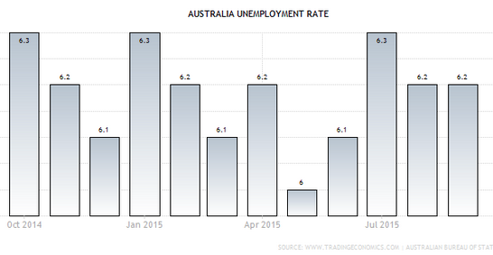
It bounces around, but I see no significant trend.  Ironically, Aussie unemployment had a mild upward trend before the commodity bust:

Screen Shot 2015-10-15 at 4.17.52 PM
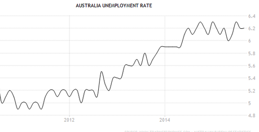
That was probably due to the slower than trend rate of NGDP growth.

And then there is Texas.  Recall that progressives keep telling us that the Texas miracle is due to oil.  Obviously there’s a grain of truth in that.  Texas does have lots of shale oil.  But so does Europe, and so does California.  The difference is that Texas actually believes in producing it.  I said a “grain” of truth, because most of the Texas growth is due to other factors.  It’s not oil, and it’s not weather (which is actually worse than many other slower growing states.) Nor is it housing, which is just as cheap in neighboring slow growth states. It’s good economic policies.

Now that we have had a big oil bust, the progressives were probably expecting a recession to hit Texas.  And yet the unemployment figures keep getting better and better:

Screen Shot 2015-10-15 at 4.21.53 PM
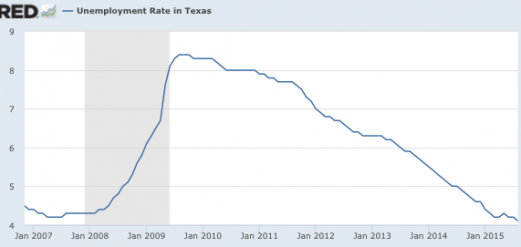
Notice that between February 2008 and June 2008, Texas unemployment actually rose from 4.3% to 4.7%, despite soaring oil prices.  The reason? US NGDP growth was slowing sharply.  Then in the second half of 2008, unemployment soared much higher, as NGDP fell (as did oil prices.)  Over the past year, the unemployment rate has continued to decline, and is now at 4.1%, just above the all-time record low of 4.0% of late 2000.

Bottom line:  Real shocks, and “reallocations” resulting from real shocks, generally don’t significantly impact the overall unemployment rate.  It’s changes in NGDP (monetary policy) that drive the business cycle.  On the other hand, real shocks can have a modestly larger impact on Texas RGDP, as the drop in oil output affects RGDP more than employment.  It’s a capital-intensive industry.

PS.  Over at Econlog I have a post on a big breakthrough for market monetarism.

Pay/productivity gap graphs are nonsense

Matt Rognlie left three excellent comments after my recent pay/productivity post, which confirmed some of my suspicions, but also cleared up a few points I was slightly confused about. In doing so, he made me even more skeptical of the graph that supposedly shows a huge gap between growth in productivity and growth in pay. Basically the graph is bogus, and has no useful information on productivity and pay, which have risen in tandem since 1965.

Matt points out that a small part of the supposed gap reflects the fact that the diagram starts at 1973, a very good year for labor.  As I pointed out (and Matt confirmed), the labor share of income has been stable since 1965, with a few ups and downs.  And 1973 was an up year.  One can debate which year is an appropriate starting point, but either way the labor share gap is no big deal.

It’s the terms of trade gap where Matt cleared up a misconception on my part. Although I didn’t mention this in the post (fortunately), I had assumed the gap reflected the fact that consumer goods prices rose faster than investment good prices. Rognlie shows that’s not the issue:

The other major component of the EPI graph is the “terms of trade” wedge, which is meant to be the gap between the price index for workers’ net output and the price index for their consumption. It’s important to emphasize that this is almost all spurious. This is clear enough from a quick sanity check – if you directly compare the behavior of the price indices for net domestic product (NDP) and personal consumption expenditures (PCE) since 1973, you’ll see that they have moved roughly in tandem: https://research.stlouisfed.org/fred2/graph/?g=1OoA

[Some seriously lengthy and obscure price index discussion ensues…]

The EPI graph appears to show otherwise only because it opts to use the CPI-U-RS, rather than the PCE price index, to deflate workers’ compensation – and the CPI-U-RS has risen by 15% more than the PCE index since 1973. On its face, this seems pretty odd: for one thing, the NDP price index (like PCE) is chained while the CPI-U-RS isn’t. If you deflate net production by the former and compensation by the latter, the result is a “productivity-pay” gap that’s partly due to formula bias!

Matt provides much more detail, and is entirely convincing on this point.  And I just want to make sure readers are not getting lost in the weeds here.  This is not one of those “he said, she said” where reasonable people can disagree on whether the PCE or CPI is a better price index.  This is a pay/productivity gap being invented by using the slowly moving price index (NDP, which is similar to the PCE) to make worker productivity look better, and the faster moving price index (CPI) to make real wages look lower.  That’s not kosher.  You need to use the same type of index for both lines on the graph.

So now we have demolished one part of the pay gap, and shown the other goes away if you start the clock in 1965 (still a good year for American workers, according to the left) and not 1973.  What’s left is the biggest category, wage inequality.  But of course it’s bizarre to put this on a pay productivity graph, as it has nothing to do with productivity and pay.  It’s all about inequality of pay among workers.  I’ll conclude with another Rognlie comment that points to the subtle sleight of hand involved in putting this on a pay/productivity graph; it makes readers think that low-skilled workers are not being compensated for their productivity, without actually providing any evidence that their productivity rose as fast as high-skilled workers.  Here’s Matt:

So… as the lengthy digressions above demonstrate, neither the “loss in labor’s share” nor the “terms-of-trade” wedges in the widely circulated EPI graph are all that meaningful. The one remaining component that is unambiguously meaningful and important is the “inequality of compensation” gap, i.e. within-labor inequality.

Now, it’s not clear that this really belongs in a chart of the “productivity-pay” gap: the implicit assumption here is that there has been no change in mean vs. median labor productivity underlying the change in mean vs. median compensation. Needless to say, that’s a rather sketchy hypothesis – most economists would regard it as unlikely, and I don’t see much evidence for it.

It’s probably best to interpret the chart, therefore, as a clever way to rebrand plain old labor inequality: the idea that pay has failed to keep up with productivity sounds like more of a scandal than does “inequality” in the abstract. The scandal looks even bigger when you add the (dubious) terms-of-trade wedge on top.

Like Scott, I’m not moved much by this kind of rebranding, but I am a utilitarian who cares about distribution and individual welfare, so I am greatly concerned about the rise in within-labor inequality. That’s why I want to keep focused on that issue – and, with any luck, stop the endless tide of confusing productivity-pay charts.

Let’s end on a positive note.  Krugman, Rognlie and I all believe that wage inequality is the real issue.  Let’s stop with all this pay/productivity nonsense and focus on the real issue.  Here’s a great proposal to reduce pay inequality, without raising unemployment.

What the RBA can and cannot do

Rajat left an interesting comment on my recent Australia post, with some quotes by top Australian policymakers:

Australia has a central bank (the RBA) that is reluctant to cut the cash rate further to avoid ‘financial instability’ due to (as Marcus says) asset price ‘bubbles’ ‘popping’. RBA Governor, Glenn Stevens, has called Sydney house prices ‘crazy’:http://www.sbs.com.au/news/article/2015/06/10/sydney-house-price-boom-crazy The media release accompanying every monthly RBA policy decision refers to property prices, particularly Sydney’s:http://www.rba.gov.au/media-releases/2015/mr-15-15.html

To me, it seems the RBA wants a certain type of ‘handover’from mining investment to other forms of growth. It seems comfortable with some increase in private consumption, but not too much. Stevens recently said:

“But the bigger point is that monetary policy alone can’t deliver everything we need and expecting too much from it can lead, in time, to much bigger problems. Much of the effect of monetary policy comes through the spending, borrowing and saving decisions of households. There isn’t much cause from research, or from current data, to expect a direct impact on business investment. But of all the three broad sectors – households, government and corporations – it is households that probably have the least scope to expand their balance sheets to drive spending. That’s because they already did that a decade or more ago. Their debt burden, while being well serviced and with low arrears rates, is already high. It is for this reason that I have previously noted some reservations about how much monetary policy can be expected to do to boost growth with lower and lower interest rates. It is not that monetary policy is entirely powerless, but its marginal effect may be smaller, and the associated risks greater, the lower interest rates go from already very low levels. I think everyone can see that.”
http://www.rba.gov.au/speeches/2015/sp-gov-2015-06-10.html

Stevens’ RBA deputy, Phil Lowe, recently said:

“I suspect that it is unlikely to be in our national interest for this more prudent approach to give way to household consumption once again growing consistently much faster than our incomes. This is something we continue to be cognisant of in the setting of monetary policy. Some decline in the rate of household saving is probably appropriate as the economy rebalances after the terms of trade and mining investment booms. But, given the position of household balance sheets, it is unlikely to be in our long-term interest for a consumption boom to be financed by a pick-up in household borrowing.”
http://www.rba.gov.au/speeches/2015/sp-dg-2015-08-12.html

However, it’s clear the RBA would love to see an increase in non-mining investment. RBA speeches frequently exhort businesses to invest in a similar manner as you once criticised Mark Carney for saying to Canadian businesses. For example, see this speech from Stevens last August:

“But the thing that is most needed now is something monetary policy can’t directly cause: more of the sort of ‘animal spirits’ needed to support an expansion of the stock of existing assets (outside the mining sector), not just a re-pricing of existing assets. There are some encouraging signs here. Nonetheless, if reports are to be believed, many businesses remain intent on sustaining a flow of dividends and returning capital to shareholders, and less focused on implementing plans for growth. Any plans for growth that might be in the top drawer remain hostage to uncertainty about the future pace of demand.”
http://www.rba.gov.au/speeches/2014/sp-gov-200814.html

The RBA would also like to see an increase in exports. The Governor’s monthly statements invariably refer to the level of the dollar and until very recently (with the AUD now down to US 70 cents from $US1.05 in 2011-13), included statements that “further depreciation seems both likely and necessary”: http://www.rba.gov.au/media-releases/2015/mr-15-11.html

Finally, while statements in support of supply-side economic reform are always welcome, to me it seems this recent speech by Stevens is a bit cheeky:

“Growth is important. And for a while now, there has not been quite enough growth. There has been growth, and more than in many countries. But, recent labour market outcomes notwithstanding, not as much as we ought to be capable of. “

Followed by:

“Reasonable people get this. They also know, intuitively, that the kind of growth we want won’t be delivered just by central bank adjustments to interest rates or short-term fiscal initiatives that bring forward demand from next year, only to have to give it back then. They are looking for more sustainable sources of growth. They want to see more genuine dynamism in the economy and to feel more confidence about their own future income.”

http://www.rba.gov.au/speeches/2015/sp-gov-2015-08-26.html

There’s a lot there, so let me give an overview of how I see these issues.

It’s fashionable to make wise sounding pronouncements about how monetary policy is not a panacea, and how we need a “balanced” approach, how we need to watch out for debt bubbles, and how fiscal must do its part, and how we need supply-side reforms, etc.

Unfortunately three issues get all mixed up here:

1.  The need to produce a stable path for NGDP (or perhaps nominal total compensation in the case of Australia.)

2.  The need for supply-side reforms to boost RGDP growth

3.  The need for financial market reforms to avoid excessive indebtedness.

Let’s clear up some misconceptions.  Monetary policy is a panacea for stable NGDP growth.  And you need stable NGDP growth (or nominal total comp.) regardless of what else is happening in the economy.  Monetary policy does not boost the economy by encouraging lending, it boosts the economy by encouraging more NGDP.  Higher lending is a side effect.

If there is excessive lending (due to moral hazard, tax breaks on debt, etc.) you still do whatever it takes to keep NGDP on target, but you also have tighter regulation of lending, so that more of the NGDP growth is non-credit oriented growth (like restaurant meals) and less is credit oriented growth (like housing.)

Monetary policy is not a panacea for a lack of RGDP growth.  Indeed the central bank should ignore RGDP.  Instead, policymakers should try to boost RGDP with supply-side reforms.

Australia’s not even at the zero bound, there’s utterly no reason not to do austerity right now.

One other point about Australia.  Watch the unemployment rate.  RGDP in Australia is distorted by mineral exports, which are not very labor intensive.  The RBA needs to keep the labor market close to equilibrium, by slow and steady growth in total labor compensation.  If RGDP and even NGDP falls and yet unemployment is stable, you have a pseudo-recession, not anything for the central bank to worry about.

HT:  Matt McOsker

Your job has never been safer

Commenter Matt directed me to some interesting data on unemployment by duration.  The government looks at people unemployed less that 5 weeks, 5 to 14, 15 to 26, and 27 weeks or more.  The most recent data is shocking, but first a bit of perspective.

The data is available back to 1948.  For many years the low in the under 5 weeks category was in 1953, when it bottomed out at 1.5545% of the workforce.  The low in the 60s boom was 1.802% in 1969, and the low in the tech boom was 1.751% in 2000.  The low in the housing boom was 1.507% in 2007.  In June of this year an all time record low was set; only 1.500% of the workforce was unemployed for less than 5 weeks.  And yet the overall unemployment rate was 5.3%, compared to about 2.5% in 1953.

Very strange.

But today’s August data shattered all previous records.  The less that 5 week unemployment fell to only 1.334% of the workforce, far lower than at any previous time in recorded history.

Basically almost no one is being laid off anymore.

Relax!  Surf the net.  Your job has never been safer.

Update:  See Matt’s comments below, which make the recent numbers a bit less dramatic, but still very impressive.

Screen Shot 2015-09-04 at 8.21.57 PMPS.  The total unemployment rate was higher in 1982 than 2009.  But compare the over 27 weeks in those two bad recessions.  Let’s see, which was the recession where they extended unemployment benefits to 99 weeks?

PPS.  Conversely, in May 1953, only 0.077% of the workforce was unemployed for more than 27 weeks.  Essentially nobody.  I guess if you couldn’t find a single job during the entire Korean War, you must have had some “issues.”

Say goodbye to the “discouraged workers”

For the past few years I’ve been suggesting that the labor force participation rate is not going to bounce back.  Commenters have insisted that the workers were just “discouraged”, and that they’d come back in and start looking for jobs when the labor market got somewhat better.

Screen Shot 2015-09-04 at 10.29.31 AM

Today the unemployment rate fell to 5.1%.  If that’s not the natural rate, it’s pretty close. Close enough so that if you really wanted a job you should at least be looking by now.  And yet the Labor force participation rate is 62.6%, the lowest level since the 1970s. No, I’m afraid the discouraged workers are gone for good.  Indeed the Fed wants to tighten now to prevent the job market from overheating!

I watched CNBC this morning during the jobs report, and the commentary was pretty funny.  They didn’t seem to think a quarter point was a big deal, and suggested that it might mean about 10% off the Dow.  But 10% corrections happen quite often, so it’s no big deal!  They were genuinely puzzled by why the stock market thought it was a big deal.  “Just a quarter point.”  One Tea Party type bragged that he’s been for a rate hike for 4 years.  I’ve noticed recently that people don’t seem at all embarrassed when their previous policy recommendations turn out to be totally wrong in retrospect.  Even worse, they don’t seem aware of the fact that they were wrong.  Monetary policy commentary is just free floating atavistic urges, completely untethered from any sort of model of policymaking, or economic data.

Over at Bloomberg there’s a new editorial today calling for the ECB to abandon its 2% inflation target and replace it with . . . with . . . with . . . I get to the end of the article and there’s just nothing.  Just get rid of the 2% inflation target.  That’s all. It would be like the captain instructing the pilot “don’t steer east by northeast.”

PS.  In my previous post I erroneously stated that the Neo-Fisherians believe in short run monetary superneutrality.  David Andolfatto pointed out that this claim is not correct.  Mea culpa.  Fortunately it did not affect any of the substantive points I was trying to make.  (I think what confused me is that short run superneutrality will also get you to Neo-Fisherism.  But it’s not a necessary condition, as I should have realized.)