Archive for September 2015


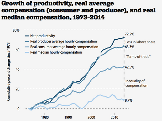
Pay/productivity gap graphs are nonsense

Matt Rognlie left three excellent comments after my recent pay/productivity post, which confirmed some of my suspicions, but also cleared up a few points I was slightly confused about. In doing so, he made me even more skeptical of the graph that supposedly shows a huge gap between growth in productivity and growth in pay. Basically the graph is bogus, and has no useful information on productivity and pay, which have risen in tandem since 1965.

Matt points out that a small part of the supposed gap reflects the fact that the diagram starts at 1973, a very good year for labor.  As I pointed out (and Matt confirmed), the labor share of income has been stable since 1965, with a few ups and downs.  And 1973 was an up year.  One can debate which year is an appropriate starting point, but either way the labor share gap is no big deal.

It’s the terms of trade gap where Matt cleared up a misconception on my part. Although I didn’t mention this in the post (fortunately), I had assumed the gap reflected the fact that consumer goods prices rose faster than investment good prices. Rognlie shows that’s not the issue:

The other major component of the EPI graph is the “terms of trade” wedge, which is meant to be the gap between the price index for workers’ net output and the price index for their consumption. It’s important to emphasize that this is almost all spurious. This is clear enough from a quick sanity check – if you directly compare the behavior of the price indices for net domestic product (NDP) and personal consumption expenditures (PCE) since 1973, you’ll see that they have moved roughly in tandem: https://research.stlouisfed.org/fred2/graph/?g=1OoA

[Some seriously lengthy and obscure price index discussion ensues…]

The EPI graph appears to show otherwise only because it opts to use the CPI-U-RS, rather than the PCE price index, to deflate workers’ compensation – and the CPI-U-RS has risen by 15% more than the PCE index since 1973. On its face, this seems pretty odd: for one thing, the NDP price index (like PCE) is chained while the CPI-U-RS isn’t. If you deflate net production by the former and compensation by the latter, the result is a “productivity-pay” gap that’s partly due to formula bias!

Matt provides much more detail, and is entirely convincing on this point.  And I just want to make sure readers are not getting lost in the weeds here.  This is not one of those “he said, she said” where reasonable people can disagree on whether the PCE or CPI is a better price index.  This is a pay/productivity gap being invented by using the slowly moving price index (NDP, which is similar to the PCE) to make worker productivity look better, and the faster moving price index (CPI) to make real wages look lower.  That’s not kosher.  You need to use the same type of index for both lines on the graph.

So now we have demolished one part of the pay gap, and shown the other goes away if you start the clock in 1965 (still a good year for American workers, according to the left) and not 1973.  What’s left is the biggest category, wage inequality.  But of course it’s bizarre to put this on a pay productivity graph, as it has nothing to do with productivity and pay.  It’s all about inequality of pay among workers.  I’ll conclude with another Rognlie comment that points to the subtle sleight of hand involved in putting this on a pay/productivity graph; it makes readers think that low-skilled workers are not being compensated for their productivity, without actually providing any evidence that their productivity rose as fast as high-skilled workers.  Here’s Matt:

So… as the lengthy digressions above demonstrate, neither the “loss in labor’s share” nor the “terms-of-trade” wedges in the widely circulated EPI graph are all that meaningful. The one remaining component that is unambiguously meaningful and important is the “inequality of compensation” gap, i.e. within-labor inequality.

Now, it’s not clear that this really belongs in a chart of the “productivity-pay” gap: the implicit assumption here is that there has been no change in mean vs. median labor productivity underlying the change in mean vs. median compensation. Needless to say, that’s a rather sketchy hypothesis – most economists would regard it as unlikely, and I don’t see much evidence for it.

It’s probably best to interpret the chart, therefore, as a clever way to rebrand plain old labor inequality: the idea that pay has failed to keep up with productivity sounds like more of a scandal than does “inequality” in the abstract. The scandal looks even bigger when you add the (dubious) terms-of-trade wedge on top.

Like Scott, I’m not moved much by this kind of rebranding, but I am a utilitarian who cares about distribution and individual welfare, so I am greatly concerned about the rise in within-labor inequality. That’s why I want to keep focused on that issue – and, with any luck, stop the endless tide of confusing productivity-pay charts.

Let’s end on a positive note.  Krugman, Rognlie and I all believe that wage inequality is the real issue.  Let’s stop with all this pay/productivity nonsense and focus on the real issue.  Here’s a great proposal to reduce pay inequality, without raising unemployment.

Gavyn Davies on 4 types of shocks

James Alexander pointed me to a fascinating piece by Gavyn Davies in the FT.  In this table, he summarizes the impact of 4 types of shocks on the various markets:

Screen Shot 2015-09-10 at 6.20.33 PMI don’t think those results always hold up (tight money can sometimes reduce real rates) but it’s pretty reliable in most cases.  Davies then argues that in recent months the behavior of markets is most consistent with monetary tightening by the Fed:

There are important conclusions from these charts:

  • The behaviour of US equities since mid 2014 has been impacted on by two supportive shocks, and two depressing shocks.

  • The supporting shocks have been a decline in risk aversion (presumably driven by a drop in the risk of a major crisis in the euro area after quantitative easing by the European Central Bank became likely), and a positive aggregate supply shock from lower oil prices.

  • The depressing shocks have been a significant monetary tightening shock as the Fed has approached lift-off, and more recently a minor negative demand shock that could have stemmed from China or the domestic US economy.

  • These shocks roughly cancelled each other out until May 2015, since when the negative shocks have started to outweigh the positive ones.

  • The sharp decline in equity prices since June 2015 has been mainly driven by a monetary tightening shock, rather than by a negative demand shock from China or elsewhere. This was initially partially offset by a beneficial supply shock from lower oil prices, but in the last couple of weeks this has reversed as oil prices have rebounded.

  • In September, the monetary shock has dampened slightly as Fed speeches have reduced expectations of a September lift off for US interest rates.

This methodology is not infallible so a sanity check is important: does it seem plausible that the model attributes much of the weakness in risk assets to a “monetary shock”? Some people will be sceptical about this, because there has been no increase in US interest rates, and no change in the Fed’s balance sheet in recent months. However, the rise in real bond yields and the decline in break-even inflation rates is clearly indicative of perceived monetary tightening. And indicators of overall financial conditions have clearly tightened. No other shocks can plausibly explain this combination [2].

Furthermore, over the past couple of weeks the timing of the ups and downs in the markets has been exactly what would be expected from the varying signals thatWilliam Dudley, Stanley Fischer and John Williams have given the markets. So this result seems fairly robust.

The most likely inference is that the markets have observed the adverse developments emerging from China, especially the possibility of further devaluations in the renminbi, and have concluded that the Fed would normally ease policy in response to these deflationary risks. Yet the Fed has seemed to be on a pre-determined path to announce lift-off before the end of the year, and has been very reluctant to deviate from that tightening path. This has been interpreted by the markets as a hawkish shift in the Fed’s policy framework.

The case for postponement of lift-off was argued strongly by both Martin Wolf andLarry Summers in the FT yesterday. The Fed will probably heed these arguments. If they do not, financial turbulence could swiftly return.

Great stuff.  Let me just add one point.  Between July and November 2008 there was a shock to the stock market, real bond yields, and TIPS spreads that was almost an order of magnitude bigger than the recent shock.  A huge shock, and according to the model presented by Davies it must have been a contractionary monetary shock.

Funny that everyone thought I was crazy when I first made that claim.

We are making progress if the FT is now publishing claims of a contractionary monetary shock during a period of very low interest rates and a bloated monetary base. Next time another 2008 happens, we MMs won’t be laughed at.  (Even better, this recognition makes another 2008 less likely.)

The very real problem of wage inequality

A commenter pointed me to Krugman’s recent post on inequality, expecting me to respond that income inequality is meaningless.  Well income inequality is meaningless, but Krugman’s post was on wage inequality, which is a real and growing problem.  It’s not one of the top ten problems facing the country, but probably makes the top 20.  (I’ll do a post on what I think are the big issues, in a few days.)

Krugman presents this graph:

Screen Shot 2015-09-10 at 2.52.56 PMI have read some of the excellent work by Matt Rognlie and Kevin Erdmann, which looks at these issues in more detail.  They found that some of the fall in wage share was going to implicit rents on owner-occupied homes.

I decided to take a fresh look at the data for my own benefit, and compared current (GDI) income (2015:2) with income from 50 years ago (1965:2).  The earlier period was the Golden Age of American labor.

And here’s what I found:

Type of (Gross) income       Share in 1965     Share in 2015

Wages and benefits                   54.6%               53.0%

Indirect taxes – subsidies          7.8%                 6.6%

Net Operating Surplus               25.7%               24.9%

Depreciation                             11.9%               15.6%

It seems silly to focus on gross domestic income, which includes depreciation and indirect taxes.  If we subtract them out we get the more conventional measure of national income, the way most people envision the concept.  And using that measure the labor’s share has been amazingly stable, rising from 68.0% in 1965 to 68.1% in 2015. Capital’s share fell from 32.0% to 31.9%.  No change in 50 years! Is that too good to be true?  Yes, for instance in 1990 labor’s share was 72.4%, so it’s just a coincidence. But it does suggest that labor’s share in the very long run is pretty stable.

So why the perception that workers are not doing well?  Krugman points out (correctly in my view) that it’s an inequality story.  Blue collar workers at GM and Ford are not doing as well as in 1965 (especially younger workers).  Workers like Goldman Sachs executives, Tom Cruise and LeBron James are doing much better than in 1965.  So the problem is not that “workers” are getting screwed by companies, but that worker income is itself becoming more unequal.  That seems like a problem to me, but then I’m a utilitarian who doesn’t think Tom Cruise deserves a high wage income just because he was lucky enough to be born with a lot of charisma and ambition.

Let’s revisit the Jeb Bush tax plan.  The structure of the plan is great; it does lots of wonderful things.  It’s not my dream consumption tax, but it’s vastly better than the current system.  But the left hates it.  I believe the plan is so good that Bush should meet the objections of the left (not now of course, but in the very unlikely event he gets elected.)  The obvious compromise is to keep the structure of the tax system as he proposes, but adjust the tax rates upward enough to make it both revenue neutral and progressivity neutral.

I normally ignore progressivity discussion in the media.  Not because I don’t care about tax progressivity, but rather because no one knows how to measure tax incidence.  Thus even though corporate taxes are not actually paid by corporations, it probably makes sense (politically) to set the new corporate tax rate at a revenue neutral level.  Or perhaps revenue neutral given whatever growth boost the CBO estimates.  And the top rate on personal income needs to be higher than 28%

Unfortunately, with taxes there will never be an end of history.  The fights between the GOP and Dems will continue.  But both sides should be willing to fight with a clean tax regime, not a monstrosity.  You can still nudge the rates up or down, as the elections change who’s in power, but you’ll do so with a much simpler regime.

I’m enough of a supply-sider to understand why the right prefers low MTRs on the rich. But given the very real increase in wage inequality, and given that never in history has it been easier to make a billion dollars by age 30, I really think you need a tin ear to propose a massive tax reform that simultaneously lowers taxes on the group that has done so well in recent decades.

PS. Earlier I said I favor a zero top income tax rate.  I still favor that.  But that’s only if we have a fairly progressive consumption tax.  This post assumes that’s too big a reach, and that this proposal is the best we can do.

PPS.  Although I said Tom Cruise does not deserve a high income, I nonetheless want him to be very rich (for utilitarian reasons.)  That’s because an economy that allows Cruise to be very rich will generate more good films for me to watch.  So yes, he should be very rich, just slightly less very rich than he actually is. Let’s face it, if you get to have young women fawning all over you because you have the guts to do dangerous stunt work in James Bond type films, when you are in your fifties, you are pretty much the luckiest man who ever lived, even if you make the LA minimum wage.

Update:  Kevin Dick sent me to this very nice graph:

Screen Shot 2015-09-10 at 5.38.54 PM

Andrew Levin on Fed policy

Soon after I finished reading Larry Summers’ powerful argument against monetary policy tightening, Marcus Nunes sent me an equally powerful piece by Andrew Levin, who previously was a special adviser to Bernanke and Yellen (2010-12), and recently joined the faculty at Dartmouth.  The intro paragraph lays out four arguments against tightening policy now.

The Federal Reserve is on the verge of triggering the process of monetary policy tightening. In particular, a number of Fed officials have indicated that the Federal Open Market Committee (FOMC) is likely to start raising its federal funds rate target within the next few months””and perhaps as soon as its upcoming meeting next week. Unfortunately, the rationale for that policy judgment rests on faulty analytical assumptions about the labor market, inflation dynamics, the stance of monetary policy, and the balance of risks to the economic outlook. Consequently, initiating monetary tightening at this juncture would be a serious policy error.

These four arguments are then developed in more detail.  For instance, here are some comments on the balance of risks:

Over the past eighteen months, FOMC statements have regularly characterized the balance of risks to the economic outlook as “nearly balanced.” Of course, that assessment has recently come into question due to a bout of financial market volatility in conjunction with shifting prospects for major foreign economies (most notably China). Regardless of how financial markets may evolve in the near term, however, it seems clear that the balance of risks remains far from symmetric. If the U.S. economy were to encounter a severe adverse shock within the next few years (whether economic, financial, or geopolitical in nature), would the FOMC have sufficient capacity to mitigate the negative consequences for economic activity and stem a downward drift of inflation? For example, if safe-haven flows caused a steep drop in Treasury yields along with a sharp widening of risk spreads, would a new round of QE still be feasible or effective? Alternatively, would the Federal Reserve implement measures to push short-term nominal rates below zero, as some other central banks have done recently? In the absence of satisfactory answers to such questions, it is essential for the FOMC to maintain a highly accommodative stance of monetary policy as long as needed to ensure that labor market slack is fully eliminated and that inflation moves back upward to its 2 percent goal. Such a strategy will help strengthen the resilience of the U.S. economy in facing any adverse shocks that may lie ahead.

This may be the strongest argument against a rate increase now.  I can understand both sides of the argument on the labor market—maybe wages will start rising more rapidly.  But I really can’t see any good arguments on the other side of the balance of risks issue.  The risks of waiting until 2016 are very low in terms of overheating and inflation.  And I’ve never accepted the “financial” argument (bubbles, etc.) as having any validity at all.  Everywhere it’s been tried (America 1929, Sweden 2010, etc.) it’s failed. Are there any successes?  Does the Fed even have any Congressional mandate to go after bubbles?  Is there a model they can point to that explains how monetary policy should prevent bubbles? Marcus also sent me a good paper on bubbles by Gadi Barlevy of the Chicago Fed.  This is from the conclusion:

Finally, with regard to policy implications, my discussion highlights various difficulties in using greater-fool theories of bubbles to justify action against potential bubbles. Although these theories can provide some justifications for why policymakers should intervene, these rationales come with many caveats. For example, policymakers may have to know that traders have incorrect beliefs, even though policymakers would not necessarily be any better at forecasting future dividends than members of the private sector. Other justifications for intervention require policymakers to be perfectly attuned to when bubbles arise””a condition that seems implausible in practice. In fact, greater-fool theories of bubbles naturally suggest the opposite, that is, that detecting bubbles is likely to be difficult. Recall that in asymmetric information models, bubbles can arise only because there is the possibility of mutual gains from trade. Thus, there may be plausible reasons for why agents trade assets beyond trying to benefit at the expense of others. Finally, the social welfare implications that emerge most clearly in these models do not seem to capture the main issue policymakers are concerned with in regard to bubbles. For example, those who argue for a more forceful policy response to potential bubbles typically expect this response to come from central banks. This reflects a view that bubbles are fueled by loose credit conditions, as well as the idea that the collapse of a bubble causes the most harm when assets were purchased on leverage and a collapse in their price would trigger a subsequent round of defaults. Yet in most models of the greater-fool theory of bubbles, credit plays only a minor role or is missing altogether.

If the FOMC wants to go chasing after bubbles, that’s their decision.  But don’t think there’s any scientific evidence supporting this quest.  In contrast, there’s lots of scientific evidence that it would cost thousands of jobs, maybe hundreds of thousands.

Why China will not fall into the middle income trap

Here’s Tyler Cowen:

Does China hitting the wall reflect a deeper reality about emerging economy growth? 

It’s easy enough to say the Chinese economy is slowing down and that is creating problems for some other countries around the world.  Never settle for such a comfortable understanding!  Might there be deeper ways to think about the problem?

I am not endorsing any of the following speculative hypotheses, rather they are attempts to imbed the Chinese slowdown into what is possibly a broader framework.  Here are a few possibilities:

1. We’ve been realizing that autocratic government isn’t as effective as we had thought.

2. We’ve been realizing that virtually all of the world’s emerging economies will be hit by “premature deindustrialization,” China included.  China will produce more manufactured goods, but because of automation this will never build a fully-sized middle class in China.  And historically service sector jobs have never had the same kind of oomph at lifting a nation over various development hurdles.  The same limitations may apply to a variety of other countries.

Counterarguments:

Tyler seems to imply that it is clear that China has hit a wall.  But the consensus forecast for China is 6.9% growth this year, and 6.7% next year.  My forecast is 6%.

China’s development so far has looked a lot like the other East Asian tigers, and almost nothing like the places that did hit a wall (Russia, Turkey, Brazil, Indonesia, South Africa, etc.)  The East Asian tigers have now become fully developed economies.

I don’t think anyone believes the Chinese recession (if it occurs) will be anywhere near as bad as South Korea’s 1998 recession (or even 1980)—and yet Korea went on to become a fully developed nation in just another 15 years!  (China will obviously take a bit longer.)

As far as premature industrialization, it hasn’t hit Taiwan or South Korea.  Hong Kong got rich despite deindustrialization. Of course China’s much bigger, but it has shown no sign of being unable to provide a middle class lifestyle for tens of millions of Han people in coastal areas, and I see no reason to believe the same can’t be done for hundreds of millions more Han people in both the coastal areas and the interior (and probably minorities as well.)  It’s really up to the Chinese government; will they do the necessary reforms?  I think the answer is “probably yes.”  Tyler seems to suggest that services are less essential that goods in the development process.  Actually, China can clearly provide it’s citizens with the housing and appliances necessary for a middle class lifestyle, that’s not even in doubt–the real question is the service sector, can they make it more efficient?

Test question:  How many countries that have cultures that are obsessed with education, saving, and hard work have failed so far?  (My guess would be China, Vietnam and North Korea, and I don’t expect any of those three to get “stuck”.  Which countries did I miss?)

Agreement:

On the positive side, I strongly agree with Tyler’s point #1.  I’ve always thought democracy leads to better economic outcomes than autocracy, and I believe China would be much better off today if it had been democratic since 1949. Unfortunately, because I believe Tyler will be wrong about China, it will become harder for me to make that argument.

I also agree with Tyler that it’s too easy to say emerging market problems are due to China.  In my view Brazil’s problems are due to Brazil.

PS.  Unless I’m mistaken this reform will make China’s data more volatile, and could substantially reduce reported Q3 growth.

China’s statistics bureau said on Wednesday it has changed the way quarterly gross domestic product data is calculated, a move it calls a step to adopt international standards and improve the accuracy of Chinese numbers.

.  .  .

Now, China is calculating GDP based on economic activity of each quarter to make the data “more accurate in measuring the seasonal economic activity and more sensitive in capturing information on short-term fluctuations”, the NBS said.

Previously, China’s quarterly GDP data, in terms of value and growth rates, was derived from cumulated figures rather than economic activity of that particular quarter, the bureau said.

The new methodology – in line with that of major developed countries – will pave the way for China to adopt the International Monetary Fund’s Special Data Dissemination Standard (SDDS) in calculating GDP, it said.

The bureau, which has revised some historical quarterly GDP figures for 2014 and prior years retrospectively, said it will publish third-quarter GDP data, due out on Oct. 19, based on the new methodology.

I never knew they used cumulated figures—no wonder the changes were so gradual.