Archive for January 2013


Is the real bills doctrine making a comeback?

Bill Woolsey has a post that is highly critical of a recent article by Richard G. Anderson and Yang Liu, who are at the St.Louis Fed.  He focused on this paragraph in their article:

The above examples of negative central bank policy rates are newsworthy because they are unusual. Some analysts have argued that such examples suggest that central banks should consider setting negative policy rates, including negative rates on deposits held at the central bank. Such proposals are foolish for a number of reasons. First, a policy rate likely would be set to a negative value only when economic conditions are so weak that the central bank has previously reduced its policy rate to zero. Identifying creditworthy borrowers during such periods is unusually challenging. How strongly should banks during such a period be encouraged to expand lending? Second, negative central bank interest rates may be interpreted as a tax on banks””a tax that is highest during periods of quantitative easing (QE).3 Central banks typically implement QE policies via large-scale asset purchases. Sellers of these assets are paid in newly created central bank deposits, which, in due course, arrive in the accounts of commercial banks at the central bank. It is an axiom of central banking that the banking system itself cannot reduce the aggregate amount of its central bank deposits no matter how many loans are made because the funds loaned by one bank eventually are redeposited at another. Is it reasonable for the central bank to impose a tax on deposits held at the central bank when the central bank itself determines the amount of such deposits held by banks and the banking system? Perhaps these and other considerations caused European Central Bank President Mario Draghi in a recent press conference to label negative deposit rates “uncharted waters” and dismiss any possibility that the ECB would consider it.

I’d like to add a few brief comments.  Their first argument sounds an awful lot like the Real Bills Doctrine (now viewed as a fallacy.  In the early years of the Fed it was believed that monetary policy should be more expansionary during booms, when the “need” for credit was greater, and more contractionary during recessions when the “need” for credit was lower.  This policy is procyclical, and may help explain why the economy actually became more unstable during the Fed’s first 30 years.

I am also confused by the second point.  Banks don’t have to hold reserve balances at the Fed if they don’t want to.  They can simply lower the interest rate on bank deposits enough to raise the currency/deposit ratio enough to reach their desired holdings of ERs.  There’s no zero bound on the interest rate on bank deposits. (As an aside, the question of whether something is a “tax” has no relationship to whether it can be avoided.  The case for imposing a new tax is actually stronger when the tax cannot be avoided.)

Evan Soltas documents the Great NGDP Expectations Crash of 2008

I have often claimed that expectations of NGDP growth crashed in late 2008, and that this caused a crash in asset prices, which made the financial crisis much worse.  Indeed it probably played a role in the demise of Lehman Brothers (although I don’t doubt that other factors relating to the subprime fiasco also played a role.)

Now Evan Soltas has found data that documents this sudden change in NGDP growth expectations:

I recently discovered that the Survey of Professional Forecasters has been recording NGDP expectations since 1968. Better yet for those inclined — that is, me — they have all of the individual anonymized forecast records, mean forecasts, median forecasts, and cross-sectional dispersion statistics on the forecasts. And it’s a quarterly forecast for several quarters ahead.

You can do a lot with this. I’ve actually never seen someone really work with Survey numbers to make the NGDP case, and this is only the tip of the iceberg. (I’m practically pleading with everyone else to write something.)

The first is a graph of mean NGDP expectations, with each line is a time series of expectations for NGDP percent growth one through five quarters out.

.  .  .

You can see the NGDP shock as a shock to expectations. Notice that the effects are noticeable for a full year out. It’s not hard to see how a sudden collapse of short-to-medium expectations, with no “bounce-back” recovery seen in the future, could be more important than current-quarter NGDP.

You should check out the various graphs in Evan’s post.

Why do smart people say crazy things?

[I added some graphs to the previous post on income and government spending.  Many readers assumed I was trying to explain why some countries are richer than others.  Not so.  I did that elsewhere.  Also, I recently did a NGDP targeting post for FT Alphaville, in case anyone is interested.]

Some commenters criticized me for putting the term ‘lunatic’ in the title of a recent post.  I suppose they are right.  But first let me explain.  Suppose back during the Zimbabwe hyperinflation someone had complained about the excessively contractionary nature of Zimbabwean monetary policy, and insisted that a more expansionary policy was needed.  Would anyone object to me calling them a “lunatic.” Zimbabwe has had the most inflation of any country during recent decades.

The country with the least inflation is Japan, a country still in the throes of deflation.  So if it would be crazy to call Zimbabwean policy too contractionary during their hyperinflation, why isn’t it crazy to call Japanese policy too expansionary?

But of course there must be more to it that that.  All of the people cited in the article are brilliant; there isn’t a lunatic among them.  So how could they hold seemingly loony opinions?

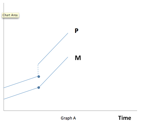
It might be based on something I learned from reading Milton Friedman back in 1972, when I was in high school.  When you change the growth rate of the money supply, something kind of strange happens.  The equilibrium price level jumps discontinuously.  Consider Graph A, where the money supply growth rate increases.  This will lead to higher inflation, and higher inflation expectations.  The higher inflation expectations will lead to lower real money demand, which causes a discontinuous jump in the equilibrium price level.  So prices rise faster than the money supply, when the money supply growth rate increases.  (Or velocity rises, if you prefer that terminology.)  And this is true even if money is 100% neutral in terms of once-and-for-all changes in the money supply.  There is a ton of data (Cagan, etc) supporting this graph.  Of course in the real world the price level doesn’t jump discontinuously to the new equilibrium, as some prices are sticky.  But the basic idea is true.

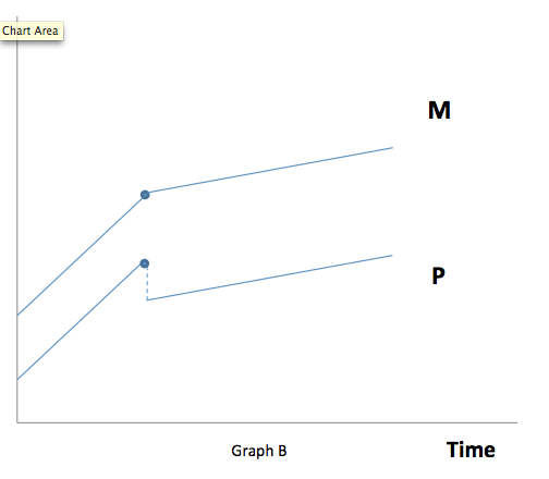
Conversely a slowdown in the money supply growth rate causes a discontinuous drop in the price level, followed by a slower rate of inflation (Graph B.)

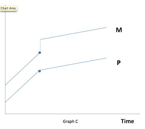
But central banks don’t like to do policies that would cause a discontinuous drop in the price level.  They are destabilizing.  So more likely if you were to slow the rate of money growth, you’d have a once-and-for all jump in the money supply to accommodate the extra real money demand at the lower inflation rate.  This is shown in Graph C. And this is pretty much what has happened in America, Japan, and a number of other countries.  Notice that during the transition period toward slower money growth, the money supply actually grows much faster than normal.

What does all this mean?  Suppose you live in a world with three kinds of countries.  One group has high and persistent inflation (say India, Vietnam, Argentina, Iran, etc.)  Another group has normal inflation and positive interest rates.  A country like Australia.   And a third group is transitioning to a new steady state with lower money supply growth, lower inflation, lower NGDP growth, and near-zero interest rates.  Let’s say this group includes the US, the Eurozone and Japan.

In that sort of world a graph with inflation on the horizontal axis and money growth on the vertical axis will be U-shaped.  The countries with near zero interest rates will see the demand for base money soar, perhaps from 5% of GDP to 20%. During that transition the average rate of money growth will be quite rapid, despite the low inflation.   The very high inflation countries will have relatively high money growth, for the normal quantity theory reasons.  And the countries in the middle (such as Australia) will often have lower rates of money growth than either extreme.

So the relationship between money growth and inflation is not always monotonic, at least when you are transitioning from one money growth rate to another.  This might be what confuses people.  The countries that seem to have the more expansionary monetary policy (in terms of money growth) will actually include those at both extremes, those that really do have ultra-easy money, and also those with ultra-tight money.

These graphs involve some tricky interaction between changes in growth rates and changes in levels.  But still, I learned this stuff in high school and I’m not that smart.  Famous policymakers should be able to understand this stuff.

Even more confusing, the relationship between interest rates and monetary policy can also demonstrate a U-shaped pattern.  Take a country that currently has low but positive interest rates, like Australia.  You can make a good case that the RBA could increase interest rates sharply with either a much easier policy or a much tighter policy.  The tighter one is what most people are familiar with—the so-called liquidity effect of less money raising short term rates.  But there is also at least one monetary policy, so outrageously hyperinflationary, that it would cause lenders to immediately demand higher rates, even on fairly short term loans.  So the U-shaped pattern also shows up with interest rates.

No wonder everyone’s so confused!  No wonder smart people say things that, when you actually stop to think about it, are completely loony. Like complaining about an easy money policy from the most contractionary fiat money central bank in all of world history.  The Zimbabwe of tight money.  The very special country of Japan.

BTW, although I’ve never really been to Japan (beyond the airport), it’s one of my favorite countries.  If there are any other Japanophiles out there, check out this delightful one hour podcast.  Colin Marshall interviewing Pico Iyer on Japan.  They had me at Colin Marshall interviews Pico Iyer.

HT:  Thanks to Konstantin Mikhailov for the graphs.


Government spending in rich countries

It’s widely known that governments in rich countries spend much more than governments in poor countries, even as a share of GDP. There are a number of possible explanations of this pattern. Perhaps rich countries choose to consume more government services, such as education, health care and pensions.  Or maybe it’s hard to extract a lot of tax revenue in poor countries where corruption in endemic and many people are peasant farmers or unregistered small businesses.  (The fact that the least corrupt rich countries (the Nordics) are especially adept at collecting tax revenue is suggestive.)

Today I’m going to look at a different question; what is the relationship between government spending and wealth among rich countries?

First I’ll list countries in order of government spending as a share of GDP.  My sample includes all countries richer that the EU average (which is $31,673 per capita GDP (PPP) in 2011:

[Update:  Commenter JN sent me data that is 2 years newer–I put it in parentheses.  Most numbers are higher–reflecting the recession?  Big swings like Ireland and Iceland might reflect the different timing of big bailouts.  Take either series with a grain of salt.]

1.  Singapore   17.0%   (17.0%)

2.  Taiwan  18.5%    (22.4%)

3.  Hong Kong 18.6%     (19.2%)

4.  UAE     26.4%    (22.3%)

5.  Qatar     27.0%   (25.1%)

6.  Kuwait   31.8%   (35.8%)

7.  Switzerland  32.0%    (34.7%)

8.  Australia   34.3%   (35.2%)

9.  Japan  37.1%    (42.8%)

10.  Luxembourg  37.2%   (42.0%)

11.  USA          38.9%    (41.7%)

12.  Canada  39.7%   (42.9%)

13.  Norway   40.2%     (44.6%)

14.  Ireland  42.0%    (48.7%)

15.  Germany  43.7%   (45.7%)

16.  Netherlands  45.9%    (50.1%)

17.  Britain   47.3%   (49.2%)

18.  Austria   49.0%    (50.5%)

19.  Finland  49.5%    (54.1%)

20.  Belgium  50.0%   (53.4%)

21.  Denmark  51.8%   (56.0%)

22.  Sweden   52.5%   (51.3%)

23.  France   52.8%    (56.1%)

24.  Iceland  57.8%   (46.1%)

And here’s a list of the countries in order of income per capita (PPP, IMF)

1.  Qatar

2.  Luxembourg

3.  Singapore

4.  Norway

5.  Hong Kong

6.  United States

7.  UAE

8.  Switzerland

9.  Netherlands

10.  Kuwait

11.  Austria

12.  Australia

13.  Ireland

14.  Sweden

15.  Canada

16.  Germany

17.  Iceland

18.  Belgium

19.  Taiwan

20.  Denmark

21.  Britain

22.  Finland

23.  France

24.  Japan

A few observations:

1.  Germany is a fairly typical rich European Country.  Of the 15 countries richer than Germany, only three have larger governments (Austria, Netherlands, Sweden).  Of the 8 countries poorer than Germany, only two have smaller governments (Taiwan, Japan.)

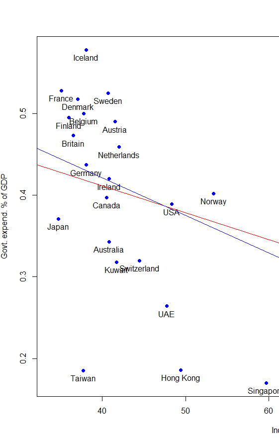
2.  It appears that among the very rich countries of the world, the correlation between per capita GDP and size of government reverses.  I can’t be certain, but I think this is even true if you exclude the 4 petro-states (Norway, UAE, Qatar, Kuwait.)

3.  Part of this reversal may be due to wealth causing less government spending.  Once the basic services are provided, a gusher of oil wealth leads to more non-government consumption.

4.  Part of this reversal may be due to high taxes reducing work effort.  Many of the richest countries (excluding petro-states?) have both lower taxes and longer working hours.

5.  What are we to make of the exceptions?

a.  Some rich countries have policies that encourage female employment, despite high taxes.  Sweden doesn’t have a marriage penalty discouraging wives from working, for instance, and provides lots of childcare.  Others have quite market-friendly policies, despite the big government.   This is especially true of the Nordics.  Thgis might explain their relatively high productivity, despite high taxes.

b.  One country on the list is arguably still developing.  Taiwan will likely move into the richer group over time. Its relatively low level of income does not reflect a lack of work effort, but rather low productivity.

c.  Japan is the real puzzle here.  Like Taiwan, hours worked are pretty long, much higher than Western Europe.  This suggests the Japanese workers are extraordinarily unproductive.  Some might point to low female labor force participation.  But that just means that Japanese females are very unproductive.  You could argue that they are at home taking care of the chilren, except that they aren’t having any children.

6.  This reversal of correlation at the top end often shows up in comparisons of similar neighbors.  The US is richer than Canada, and has a slightly smaller government.  Australia is richer than New Zealand, and has a significantly smaller government.  Switzerland is richer than Austria, and has a smaller government.  Norway is the richest of the Nordics, and has the smallest government.  Belgium is ethnically part French and part Dutch, and both its size of government and its wealth is midway between the two.  Spain is richer than Portugal and has a smaller government.

7.  The East Asian rich tend to have small governments.  South Korea was a bit too poor to make the list, but its government spends only 30% of GDP.  It will be on the list quite soon.  This pattern has huge implications for where the world’s biggest economy (no, not the US anymore) will end up on the list.

8.  I predict that within a few decades the US will no longer be regarded as an outlier.  It will no longer be regarded as a very rich country with a surprisingly small government.

9.  Clinton said the era of big government is over.  Obama seems determined to prove Clinton wrong.  (Don’t ya just love it when progressives insist Obama is a centrist.  Yes, he’s right in the center of progressivism.)  This data has support for both sides.  It shows that a country can be fairly rich, and still have a very large government.  But it also suggests that if Obama pushes the size of government substantially higher, there may be a price to pay.  We’ll still be rich, but not as rich.  More like France than Switzerland or Norway.  I’m not sure how voters would react to that outcome.

10.  Sweden’s government is vastly larger than the Swiss government, and yet from an American perspective the two countries seem quite similar.  Do both liberals and conservatives overrate the importance of big government?  I.e. are conservatives wrong that it would wreck the economy, and are liberals wrong that lots more government spending would greatly improve quality of life?  If so, why isn’t Switzerland a hellhole, and why isn’t Sweden poor?

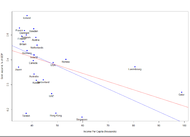
Overall I don’t know if the sample is big enough to be statistically significant, especially without the petro-states.  Taiwan would have a big impact–so maybe the results will be different in ten years.  If anyone wants to do a regression and/or graph, I’ll add it to the post.  If you could find data for government spending and hours worked, the correlation might even be stronger than for wealth.

PS. I could not find size of government data for San Marino and Brunei, which is probably just as well.

Update:  Christopher Burgoyne sent me some graphs with trend lines. The blue line is without the petro-states and the red line is with them included. Even the without is distorted by Luxembourg. But if you look at the core countries and leave out the tiny outliers, it still looks slightly downward sloping to me.
The first market monetarist book.

Marcus Nunes and Benjamin Cole are familiar names to those who follow market monetarist ideas.  Marcus has an excellent blog, and has supplied me with some of my best ideas.  Benjamin Cole is a frequent commenter and a very persuasive writer.  Now they have produced the first book applying market monetarist ideas to monetary policy during recent decades.  I wrote the foreword:

During the 1930s most people thought the Great Depression represented a relapse after the exuberant boom of the 1920s, worsened by a severe international financial crisis.  Then in the 1960s Milton Friedman and Anna Schwartz showed that the real problem was an excessively contractionary monetary policy.  Yes, the Fed cut interest rates close to zero, and did what is now called “quantitative easing,” but it was too little too late.  At Friedman’s 90th birthday party Ben Bernanke gave a speech that included this memorable promise:

“Let me end my talk by abusing slightly my status as an official representative of the Federal Reserve. I would like to say to Milton and Anna: Regarding the Great Depression. You’re right, we did it. We’re very sorry. But thanks to you, we won’t do it again.”

In this path-breaking study of the Great Recession, Marcus Nunes and Benjamin Cole show that Ben Bernanke and the Fed made many of the same mistakes that were made during the 1930s.  Yes, the Fed was more active this time.  And yes, it could have been much worse.  But our monetary policymakers still haven’t fully understood the importance of adopting a monetary policy that does whatever it takes to keep nominal GDP growing at a rate consistent with economic prosperity and low inflation.

Nunes and Cole are part of a new movement called “market monetarism” which first arose on the internet and has recently revolutionized the way economists think about monetary policy in a deep slump.  Prior to the recession, the standard formula called for adjusting interest rates up and down in order to target inflation.  The hope was that a low and stable inflation rate would insure economic prosperity.  We now know that this policy is not enough.

Nunes and Cole trace the evolution of monetary policy from the 1960s to the present.  They show how monetary policy failures led to the Great Inflation of the late 1960s, how Paul Volcker and the Fed brought inflation to much lower levels in the 1980s, and then how the Fed was able to produce a long period of stable growth and low inflation.  The key was that the Fed never slavishly targeted inflation, but rather kept nominal GDP (i.e. total spending) growing at close to a 5.5% trend line.

They also show how the ideology of “inflation targeting” became increasingly dominant at the Fed in recent years.  The Fed lost its focus on nominal spending, and during 2008-09 didn’t realize the dangers of the sharp decline in nominal GDP until it was too late.  By that point, interest rates had fallen to zero.  But this didn’t represent “easy money” as people often assume, just as high interest rates during hyperinflation don’t represent “tight money.” Low interest rates reflected the weak condition of the economy.

With rates near zero, the Fed had to move on to more “unconventional” stimulus techniques.  This is where the inflation targeting ideology created problems for policymakers.  They saw a need for stimulus, but were so afraid that inflation would rise above 2% that they were very slow and tentative in developing alternative policies.  Their job was made much harder by their refusal to admit their mistake, and switch to a nominal GDP target, which would boost current demand by increasing expectations of future growth in spending.

Meanwhile economists outside the Fed were increasingly drawn to nominal GDP targeting, with an all-star list including Christina Romer, Paul Krugman, Jan Hatzius, and Jeffrey Frankel endorsing the market monetarist proposal for NGDP “level targeting.” More recently, Mark Carney endorsed the idea.  Carney’s endorsement represents an important breakthrough, as he will assume leadership at the Bank of England later in 2013.

Over the past few years both Marcus Nunes and I have developed blogs focused on promoting market monetarist ideas.  Benjamin Cole has also participated in the blogging debate, doing guest posts at various sites.  Marcus brought to light some of Ben Bernanke’s earlier academic papers that warned Japan not to be timid in using monetary stimulus when interest rates fell to zero.  And yet after 2008 the Fed refused to do some of the more aggressive monetary actions that Bernanke recommended to the Japanese.

Marcus is also very skilled at using graphs to tell a story, and the graphs in this book are one of its strong points.  I’d add that Benjamin Cole also contributed greatly to the market monetarist movement, and is a powerful writer.

At first readers might be skeptical of some of the arguments made by Nunes and Cole.  In 2008 and 2009 it didn’t seem like monetary policy was the cause of the crisis, or even that there was much the Fed could do to fix the problem.  I’d ask readers to suspend their disbelief until they’ve looked at all of the evidence.  Monetary economics is a very counterintuitive field.  Most people think the Fed merely moves interest rates up and down, and that once rates fall to zero there’s nothing more the Fed can do to stimulate the economy.  But cutting edge research in recent decades has suggested otherwise.  We now know that low interest rates do not mean easy money, and that there are lots of things the Fed can do to boost spending once rates hit zero.

If readers take an open-minded look at the evidence in this book, I believe they will be very surprised by what they see.  The financial crisis and Great Recession that followed were not at all what they seemed to be at the time.  The profession is beginning to come around to the market monetarist view of the importance of a stable growth path for nominal GDP, and this perspective casts a whole new light on the events of the past 5 years.