

The good, the bad and the horrific
It’s become a cliche that people use misleading statistics. In this post, I’m going to explain how I believe the Covid-19 data should be organized, and why I don’t like many other ways of describing the pandemic.
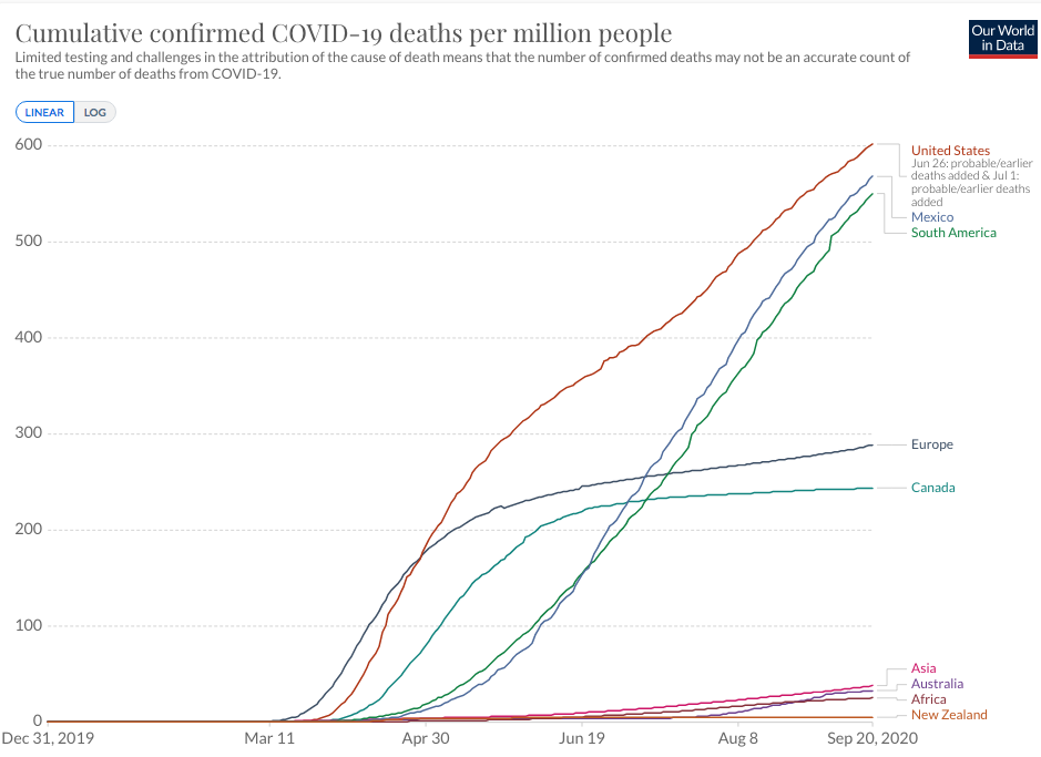
In this pandemic, there seem to be three distinct regions of the world. Greater Latin America goes from the US-Canadian border all the way down to Cape Horn. The fatality rate is nearly 600/million, and rising fast. Greater Europe reaches across the Atlantic to include Canada. This region has a fatality rate below 300/million, rising modestly. And Asia/Africa/Australia has a vastly lower death rate, somewhere between 20 and 40 per million, rising modestly.
You see articles with very different takes. Headlines that India’s now hit harder than any other country. Or that the US is about equal to the UK and doing better than Spain. I don’t find these ways of framing the data to be useful.
The US is a vast, continental size country, with widely varying fatality rates. You can find areas where the fatality rate is lower than in Canada. At the same time, there’s pretty clearly something going on at the US/Canada border. The best America state (Alaska) has 62 death per million, while in Canada there are provinces with no deaths at all. Indeed they have 8 provinces with a combined death toll of 45, the same as Alaska, but with many times more people than Alaska. So whether you compare averages vs. averages, worst vs. worst, best vs. best, or just similar type states/provinces, the US is clearly doing worse than Canada—by almost all metrics. Indeed Canada as a whole is now doing better than even North Dakota. (BTW, Canada is roughly as urban as America.)
The worst hit parts of Europe are slightly worse off than the US average, but then the worst hit parts of the US are dramatically worse that the worst countries in Europe. People who want to sugar coat our awful outcome like to cherry pick the worst hit parts of Europe and compare that region to the entire US, including places like Alaska. That makes no sense. Compare worst areas with worst areas–say Spain with the northeastern US.
As for India, yes it now has lots of cases. But it also has 1.4 billion people, 4 1/2 times the US population.
When I look at the data I see three distinct areas. US/Latin America, Europe/Canada, and the other 80% of planet Earth. Maybe that will change, but right now that’s the pattern. You can slice or dice the data any way you wish, but if you reach radically different conclusions from me then I suspect that you are manipulating the data to reach a conclusion.
Tags:
21. September 2020 at 13:52
I never liked the theory of natural immunity, but looking at your graph, one has to start wondering what other explanations might fit in at all. The nearly exact geographical division into three parts is quite astonishing.
The only outlier seems to be Canada. If it is not natural immunity, it may be cultural differences. Canada has always been the “Europe” of America.
Let’s assume it’s a combination of both.
21. September 2020 at 15:50
Christian, It’s much more likely cultural, as you are correct that Canada is by far the most “European” part of the Western hemisphere. Australia’s the bigger puzzle.
21. September 2020 at 20:30
Scott,
I agree you are right again. It’s more likely cultural. Maybe the Australians (and New Zealanders) have simply adopted relevant parts of “Asian” culture by now. They probably have also experienced SARS-1 relatively closely.
Africa is currently the hardest to explain for me, both in terms of immunity and culture. Where would they get immunity from, and the culture there seems rather chaotic. Maybe it’s the young age of their population.
21. September 2020 at 20:37
I find it even more disturbing that there is so little reporting/analysis of the possible drivers of Europe/US results: mandated v voluntary social distancing, testing.
21. September 2020 at 23:36
Scott, I agree with most of what you say, but when you say this:
“People who want to sugar coat our awful outcome like to cherry pick the worst hit parts of Europe and compare that region to the entire US, including places like Alaska.”
I kind of feel like you are doing the same thing when you say this:
“When I look at the data I see three distinct areas. US/Latin America, Europe/Canada, and the other 80% of planet Earth.”
Like you point out, The US is really big, and it’s had very different outcomes based on location. The EU has about 360 deaths per million. About 95 million Americans live in states that are at or below that number.
Also, I chose the EU and not all of Europe to try and make a decent comparison, because there are a lot of European countries that have much more suspect data than the US. For example, Ukraine has a reported death rate of 82/million, but they also are testing about a third as many people as the _worst_ US state. I put very little stock in that 82 number. However, just going with the EU wasn’t very good because that still includes large countries like Poland, Romania, and the Netherlands who are all testing significantly fewer people.
So, I agree that it is silly to compare the whole US to, say, Spain, but I also think it is silly to lump California in with New Jersey.
21. September 2020 at 23:58
The only data that are comparable is “excess deaths per capita [or per million]”. On that metric, the US and the EU are more similar (the US has a higher fraction of its excess deaths officially classified as covid as they came later in the pandemic + countries like France were clearly undercounting when there were official policies to NOT performe any tests in retirement homes).
About 200,000 excess deaths in Euromomo’s panel of 24 countries: https://www.euromomo.eu/graphs-and-maps (not the full EU, but it’s not a selection of the worst), which should have a total population roughly comparable to US.
22. September 2020 at 01:12
Am I going senile or is Sumner? I distinctly recall we covered exactly this post last week. I even commented that Asia probably is seeing a different strain of the virus not to mention warmer weather there. Europe however is a good comparison to the USA and you can see the effects of a total lockdown, it flattens the curve.
22. September 2020 at 12:09
https://web.sapmed.ac.jp/canmol/coronavirus/index_e.html
22. September 2020 at 12:09
The sizable variation in outcomes across the United States is very interesting.
Utah, for example, has so far handled the pandemic very well, having only 138 deaths per million with an August unemployment rate of just 4.1%.
Louisiana, by contrast, has 1,159 deaths per million and its unemployment rate is far above Utah’s at 7.6%.
Is there anything we can learn from the more successful states?
22. September 2020 at 20:05
I’m writing from Australia, with a sense of dismay that USA has let Covid-19 reap so much loss. Seeing the health authorities’ response in Wuhan in January indicated to all other countries the need for a vigorous lock-down to control the epi (now pan)demic. How could US citizens have neglected to implement country-wide public health measures, when the early cases in Seattle suggested it was spreading rapidly? Tom Hanks, among others brought it to Australia in March. We don’t hold it against him. In fact he’s back to finish making the ‘Elvis’ movie!
22. September 2020 at 21:48
Jay, I think you misunderstood my point. When I say America and Latin America were doing poorly, I didn’t mean uniformly poorly. I meant more poorly on average than other regions.
You are right that it varies by region. But that doesn’t make national averages meaningless. For instance, just because America has extremely rich zip codes and extremely poor zip codes doesn’t mean our overall average per capita GDP can’t be compared to Canada or Mexico or Haiti. But suppose someone compared Canada’s average income to the income on a Navaho indian reservation in Arizona. Or to Beverly Hills. Would that be meaningful? That was my point.
Justin, Some of the difference is due to luck, i.e. which areas were hit first. Some may reflect civic culture. Utah has a reputation for having well behaved people.
Oliver, I have fond memories of the time I spent living in Australia in 1991. America is not the same country it was back then; we’ve become a sort of banana republic. I share your dismay, although I’m mostly insulated from America’s problems here in affluent Orange County.
22. September 2020 at 21:50
Justin, I’d add that Washington state is interesting, going from the very worst hit state to pretty far down the list. They seem to have gotten their act together.
23. September 2020 at 05:39
Why don’t we do comparison of countries on age adjusted deaths? Why do we not even talk about it? CDC saya about 32% of all US deaths of people WITH Covid were over age 85. Another 32% of all such deaths are between ages 75-85. 31% are between 45-75. 5% are under 45.
That should be the comparison. Shouldn’t having known this (we did actually) have dictated our collective response? Why is no one interested in what Covid deaths “would have been” if we used the models we have always used for the Flu? (we do not “count” deaths by flu—-but models) We were going to do that——but felt counting was better. It turns out that was correct as the age distribution for Covid is radically different than flu—-assuming our models are true.
Scott loves this topic because he believes Trump handled it wrong—-He has not really shown in clarity a well developed argument—-although Trump—and CDC—-and media—and Scott, also we’re “wrong”.
So we still get these superficial essays——and no explanation as to why East Asia is 1/30th or so of the rest of the world. Ray thinks it is different strain. Maybe. Others think they are better mask wearers. Maybe. I think they just count differently. That is also a maybe.
23. September 2020 at 06:09
Actually it is 2.5% under 45. Question. Why did we not discuss age distribution with all our science? So called science. That was the most important fact. That was the LEAD story. Everything should have been designed around age. They knew this. Hid it. Never discussed it. No one thought of how to design a framework for this. In fact, it almost seems like an Emmanuel conspiracy to kill the aged. 80+ % of the old were in nursing homes. The governors were morons or killers. Then we closed down the economy—
I do not believe we were merely incompetent—-although that is the best guess. I think we were complicit too. Who is “we”? CDC.
23. September 2020 at 12:16
Michael, You said:
“Scott loves this topic because he believes Trump handled it wrong—-He has not really shown in clarity a well developed argument”
LOL. Trump discouraged social distancing, he discouraged masks, he opposed testing. Those are the three main ways of controlling the problem!
You Trumpistas have lost your ability to process information.
26. September 2020 at 09:22
The pot calling the kettle black. The author is trying to digest and parse “misleading statistics” himself. The data being displayed is “apples and oranges” which corrupts the comparative analysis and interpretation. The USA mortality rate is grossly exaggerated due to financial incentives (see link below). I guarantee none of the diverse international sources who recorded individual covid deaths at the points of death used the same criteria for attribution.
/www.investmentwatchblog.com/heres-how-the-us-has-reach-200000-covid-deaths/
26. September 2020 at 21:55
MFB, Actually, the US mortality data understates the true impact of Covid. You link is broken, but do you really want to go through life relying on nutty crackpot internet conspiracy theory websites? Is that how you get your kicks?