

Is an NGDP Phillips Curve somehow “wrong”?
I touched on this issue over at Econlog, but I’ll try again here in slightly a different way.
The original Phillips Curve from 1958 had nominal wage inflation on the vertical axis. (Actually the original original PC was developed by Irving Fisher in the 1920s, and used price inflation.) Then American economists switched to price inflation in the 1960s. In the 1970s and 1980s, economists accepted the Natural Rate Hypothesis and the expectations-augmented Phillips Curve was developed:
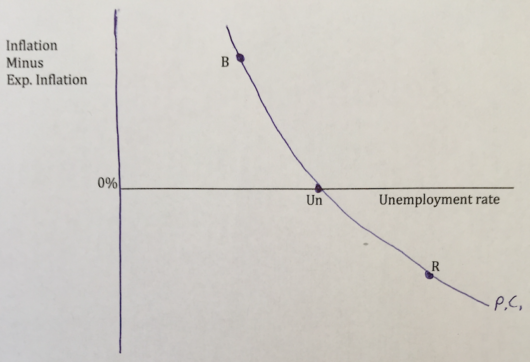 When inflation is higher than expected you are in a boom, and when it’s lower than expected you are in a recession.
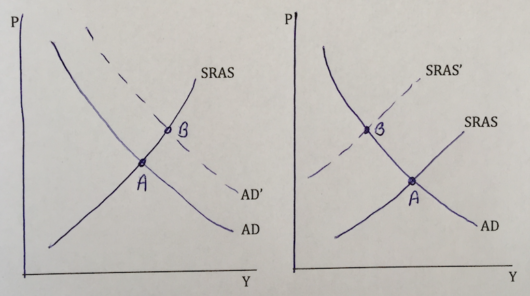
But inflation probably not the right variable, for standard “never reason from a price level change” reasons. Higher inflation can reflect more AD, or less AS:
 So what is the right variable? As far as I can tell, the Phillips Curve should be using unexpected changes in NGDP:
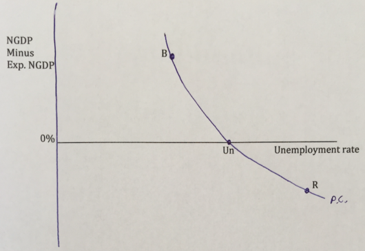 So here’s my question to economics instructors. Suppose you have an advanced topics chapter at the end of macro 101, which covers the standard Phillips Curve (using inflation), and discusses the Natural Rate Hypothesis and the importance of expectations. Would it be acceptable to have a section at the very end of that chapter with the final two graphs shown here? I.e., the two AS/AD graphs to show students the downside of using inflation as an indicator of whether the economy is overheating, and the NGDP version of the Phillips Curve to explain to students why more and more economists favor NGDP targeting.
Or is there something I am missing, which makes NGDP unsuitable for the vertical axis of a Phillips Curve?
PS. The principles textbook I’m working on will be ready for consideration later this year, available for use in classes in the fall of 2019.
Tags:
23. January 2018 at 20:05
I can see how you might get a boom if people have too low inflation expectations – they will supply more labor than they would if they knew the true value of their nominal wages over the next period.
I’m having trouble seeing why they would do the same if they have incorrect NGDP expectations (and even assuming that most people have meaningful NGDP expectations in the first place). If I think NGDP is going to be 3%, and its actually 5% – then without knowing how much of this extra 2% is due to inflation rather than RGDP growth then its not clear if I am over-valuing or undervaluing my nominal wage.
24. January 2018 at 01:30
But doesn’t NGDP and Unemployment have the same component of real GDP ( directly for NGDP and indirectly on unemployment, depending on your view of Okun’s law, I guess? )? Would it be a problem??
24. January 2018 at 04:35
If people mentally translated “NGDP minus expected NGDP” as “level of insufficient demand” they might find that version of the Phillips Curve more readily accessible.
24. January 2018 at 04:37
Whoops, reversed the sign!
24. January 2018 at 06:48
Scott,
I’m not an economics instructor, but I think it is quite reasonable to discuss an NGDP-based Phillips curve, even though until an NGDP futures market exists, it’s hard to know with certainty, most of the time, where NGDP is relative to expectations.
In light of your comments on anti-EMH theories, I think it makes far more sense than teaching about NAIRU as anything other than an interesting historical curiosity that is basically useless from a practical perspective. Unemployment is at 4.1%, down from 4.7% a year ago, and PCE Core YoY is just 1.4% with no acceleration in sight in recent months. Just a few years ago, I remember the Fed saying that NAIRU was 5%+. And under an NGDP targeting regime, which we hopefully end up with before too long, inflation would accelerate as unemployment rises.
To me, a person saying that “unemployment is at/near/below NAIRU” is sort of a like a person telling me that “US stocks are in a bubble”. It’s useless information.
24. January 2018 at 08:07
Market, I think it’s much more likely that people have NGDP expectations (national income) than inflation expectations. Have you ever met any non-economist who knows what inflation is? Yes, they don’t know the term ‘NGDP’, but I think people do sort of understand the concept of total national income. They have their own income to use as an example. In contrast, there is nothing in their personal daily life anything like “inflation” for them to refer to.
Cloud, Why would that be a problem?
Brent, Good point.
Justin, Yes, the NAIRU is very hard to estimate.
24. January 2018 at 08:37
Scott, maybe you should use the original Phillips curve instead with a slight modification: “nominal wages – expected nominal wages” on the vertical axis Unemployment goes up whenever nominal wages fall below their expected level. This seems to me the more natural link when discussing unemployment.
Of course, this would rather call for a nominal wage target.
However, with a constant labor share of GDP, total nominal wages is just a constant fraction of nominal GDP. So targeting the one is just as good as targeting the other.
Only for small open economies like Ireland where the two series might actually divert a lot, a nominal wage target might actually be much superior.
I know that you’ve discussed this elsewhere.
24. January 2018 at 08:38
Dr. Sumner,
If one plots Nominal Gross Domestic Product (NGDP) over time on a quarterly basis between January 1949 and July 2017 and U-3 unemployment rate over the same period the plot reveals not clear pattern [1]. However if the data is plotted on a Year Over Year Percent Change basis an inverse relationship is strongly suggested [2]. In this period (275 quarters) the median YOYPC for U-3 -5.1% (25th Percentile =-11.3 %, 75th Percentile = 7.3 %) and the median YOYPC for NGDP was 6.3% (25th Percentile = 4.3 %, 75th Percentile = 8.3 %). The Pearson Product Moment Correlation (PPMC) coefficient of correlation (R2) is -0.59 (p<0.00001). That would suggest a very strong basis for your curve (The Spearman Rank Correlation R2 = -0.4 p < 0.00001). However rather than a second order curve, it appears to be a first order curve. The correlation is actually stronger if only the last 20 years of data is used Pearson Product Moment Correlation (PPMC) coefficient of correlation (R2) is -0.76 (p<0.00001 n = 81) [3].
There does indeed appear to be a first order NGDP U-3 Phillips Curve.
[1] http://tinyurl.com/yb953fdv
[2] http://tinyurl.com/yab9h7xy
[3] http://tinyurl.com/zj22jey
24. January 2018 at 08:47
Hi Scott
Will there be a draft available? Would be very interested to consider it for my courses and happy to comment.
Best Daniel
24. January 2018 at 09:08
Scrap the Phillips curve entirely, except perhaps as a historical curiosity. It has no value as a practical or theoretical tool. What function does it serve? A bad rationalization for bad Fed policy, I suppose.
24. January 2018 at 09:34
Julius, Good point. I suppose the reason I like using NGDP instead of W is that there is currently a groundswell of support for NGDP targeting. How can we explain this to students? Since they already cover the Phillips Curve, it’s seems like an easy modification, which allows people to see the intuition behind NGDP targeting.
David, Thanks for that info.
Doug, Tracing out the evolution of ideas on the Phillips Curve is actually a useful teaching tool.
24. January 2018 at 09:52
Scott,
I am with Julius on this… use nominal wages – expected wages. People can readily understand that. They know their nominal wages and they have expectations for wages. Almost no non-economist has any idea what nominal gdp is, what it’s level is, and hence they have no expectations regarding that.
Explain it that way, then move to explain why a nominal gdp target is the same thing. This seems like th best path for explaining this to me.
24. January 2018 at 10:55
I believe Woodford’s model actually does use NGDP or aggregate demand as the determinant of the Phillips Curve. In his section on a “New Classical Phillips Curve” (see 2003, 158) he notes that “monetary policy affects real activity in this model only insofar as it causes unexpected variation in nominal spending,” which then affects real activity through sticky prices. The vertical axis in Woodford, which he doesn’t draw out, is NGDP – expected NGDP, and the horizontal axis is real output. The slope of the curve is dependent on exactly how sticky prices are. In a sense, the downward sloping output curve should be a reverse of a sticky-prices “inflation Phillips curve,” if I could try an unfortunate term. If you plotted NGDP – expected NGDP on the vertical, and inflation on the horizontal, the less sticky prices were, the more vertical the inflation curve would be, and this would bear a clear relationship to the output curve at the same level of “stickiness.” The same sticky price relationship would make the output curve more horizontal. This perhaps explains why inflation is a bad variable for the Phillips Curve. If we assume that sticky prices are at the root of the Phillips Curve relationship, what the curve actually shows is how much or how little a change in nominal demand is manifest in measured inflation. The more responsive output is to demand shifts, the less inflation will manifest (at least in the short-term when the curve is not vertical).
This gets to the debate above about using nominal wages on the vertical axis. Ideally, you’d want the two axes to be in clear causal relationship, and therefore nominal – expected wages would best work with a horizontal axis that is unemployment, while real output might be a better relationship with NGDP (unless, as I think you do, you think most output variation comes from sticky wages). Perhaps though, like sometimes in economics, the placing of what the basic model assumes is the dependent variable (output, unemployment) on the horizontal axis confused some people into thinking that was the independent variable (which is demand, inflation etc.)
Obviously, though, the Phillips curve was originally just an empirical relationship, so real output or unemployment on the horizontal, or nominal wage growth on the vertical, would still work for finding some clear empirical relationships over time (especially where monetary policy approximates a random walk). And the graph itself makes no necessary claims about causality. I suppose it all depends on what you want to use the curve to illustrate.
24. January 2018 at 11:00
Forgive me if this is a dumb question, or preaching to the choir, but aren’t all these curves just plain wrong because they’re symmetrical? Sticky prices says there should be some kind of big discontinuity at the point where whatever it falls below a change of 0 from what’s expected.
24. January 2018 at 11:48
Scott,
Unless I’m mistaken, the Phillips curve has unemployment increasing at an increasing rate as NGDP unexpectedly falls below 0. If so, this can’t be right, because even a cursory look at the data suggests unemployment increases at a decreasing rate under such a circumstance.
That would mean there should be a discontinuity, as Eliezer suggests.
24. January 2018 at 12:48
I should note that I meant in Woodward’s model there is a downward sloping output gap curve, not real output curve.
24. January 2018 at 13:04
Daniel, Thanks, I sent you an email, let me know if you didn’t get it.
Student and Julius, OK, I sort of see your point. Let me think about it a bit.
I do think that most people would have an easier time understanding a PC with NGDP rather than inflation. To see why ask average people the following question:
1. Does it make sense that a rising cost of living would be associated with a strong job market?
2. Does it make sense that the job market would be strong when the total income of Americans is rising fast?
I think the second question makes more sense to most people.
Judge, Very good points.
Eliezer, I don’t see any reason for a discontinuity. The models are symmetrical in the sense that prices and wages are sticky in both directions.
Mike, I think the curvature reflect the fact that it’s really hard to reduce unemployment below a certain level. When unemployment is 5%, it much easier to raise the rate to 10% than to lower it to 0%.
24. January 2018 at 16:10
You are right about that, I have tried to casually converse about 1 and it’s laughed off, 2 people can get. Funny how put that way it seems more palitable. On second thought, don’t listen to me, I am neither a macro guy or an instructor. Haha.
24. January 2018 at 17:03
I’d say an NGDP version would be superior to the inflation one.
Suppose prices (and price expectations) were completely fixed, the inflation phillips curve would be horizontal at inflation = 0. But an unexpected decline in NGDP would still lead to a rise in unemployment.
29. January 2018 at 14:22
Scott: on your question about the NGDP Phillips Curve: take the limiting case, as prices get stickier and stickier. In the limit, what we would observe would be a sort of production function cum Okun’s Law. The relation between RGDP and unemployment. The slope would tell us about labour productivity, and the relation between unemployment and employment.
In the more general case, the slope would be a mixture of the above and wage/price stickiness.
29. January 2018 at 14:53
Nick, Yes, the limiting case you describe is the “Keynesian cross” case, where real and nominal fluctuations are pretty much the same in the short run.
So then think about what makes the Keynesian cross model wrong, as (for example) an explanation of inflation. It’s wrong due to supply shocks, aka price shocks, and it’s also wrong because inflation expectations change.
So then in this real world where the limiting case doesn’t hold because we can’t assume a stable price level, is an NGDP Phillips curve superior to an inflation Phillips curve, in the sense of being a better guide to policy?
Just to be clear, even the NGDP Phillips curve shown above is not very useful in a place like Zimbabwe, circa 2008, when higher than expected NGDP growth was associated with falling output. But it seems fine for the US, and almost as good for Canada.