Archive for March 2015


Recent activity

I’ll try to keep blogging, but things may slow down a bit as tax season approaches. Meanwhile I have a new post at Econlog comparing Asia, Europe and immigrant societies.  I’ve also had some recent luck getting into major news outlets. A few weeks ago it was the WSJ, today I have a piece in the New York Times (on the strong dollar.)  AFAIK, that’s my first, and hopefully not my last.  Which reminds me, after the sad experience of Razib Khan (recently hired and fired by the NYT on the same day), don’t anyone dare send the Times any of my earlier posts criticizing their fine newspaper.  I take everything back.

🙂

Global growth

McKinsey sends me their global economic reports, which are also available online. This caught my eye:

Screen Shot 2015-03-11 at 4.16.14 PMHow is that even possible?  Here’s how:

Screen Shot 2015-03-11 at 4.20.31 PM

You can see that the horizontal box representing China is about the size of the beige triangle, representing global GDP when I was 9 years old.  America’s per capita GDP has more than doubled.  The biggest gains went to blacks, Hispanics and Asians (in the case of the latter two groups, partly because many were living in other countries in 1964.) But whites are also modestly better off.

Of course that’s not where the action is.  In 1964 China was about as poor as the worst basket case in the world today.  Poorer than India in 1964.  You can barely see the rectangle.  So if you wanted to explain to someone from outer space what happened to the world over the last fifty years, you’d say Asians got a lot richer. Everything else is a footnote.

Here’s another nice graph:

Screen Shot 2015-03-11 at 4.29.43 PMSo that group of countries will gain 347 million workers (2014-64), but India and Nigeria alone gain 408 million.  Again, China is the elephant in the room, losing a massive 152 million workers.

The next graph shows the uncanny similarity between India and Indonesia, both over the past 50 years and the next 50.

Be careful, however, they have South Korea growing 4.3%.  South Korea’s already a developed country, and even McKinsey admits their population will decline.  If they growth 4.3% over the next 50 years then I will be the next Pope.  Perhaps they confused the two Koreas—North Korea will probably be the fastest growing country in the world over the next 50 years.  Japan’s growth rate will be close to zero, not 2.1%.Screen Shot 2015-03-11 at 4.33.59 PM

Mugged by reality

Progressives of the younger generation may wonder what led to the curious phenomenon of “neoliberalism.”  Why did some 1960s progressives gradually become more conservative over time?  There are many reasons, but crime is one issue that almost certainly played a role.  Take a look at the US murder rate from 1950 to 1962 (per 100,000):

1950 – 4.6

1951 – 4.4

1952 – 4.6

1953 – 4.5

1954 – 4.2

1955 – 4.1

1956 – 4.1

1957 – 4.0

1958 – 4.8

1959 – 4.9

1960 – 5.1

1961 – 4.8

1962 – 4.6

No net change, but pretty high.  Suppose that like all good liberals you believe that America’s unusually high murder rate is due to poverty and guns.  What would you expect to happen to that murder rate if the US succeeded in dramatically reducing the poverty rate over the next 12 years?  You’d obviously expect a sharp fall in the murder rate. First, here’s what actually happened to poverty:

Screen Shot 2015-03-18 at 9.21.16 PM
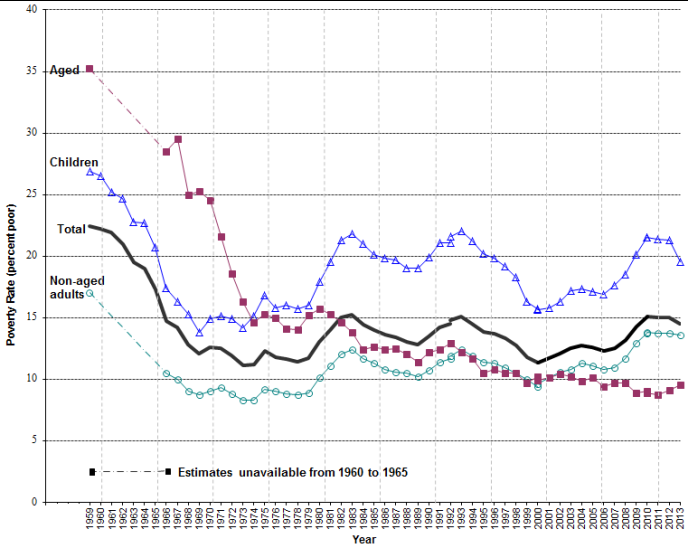
Take a look at the poverty rate in 1962, about 21%.  That’s down slightly from previous decades, but still pretty high.  Then something dramatic happened, poverty started falling really fast.  In 1964 LBJ announced a “War on Poverty,” although to be honest the decline began even before those programs really kicked in a few years later.  I’d guess the civil rights movement also played a role, as did the economic boom of the 1960s. By 1974 the poverty rate was less than 12%.

And here’s what happened to the murder rate during the golden boom years of plentiful jobs for the working class and amazing poverty reduction:

1963 – 4.6

1964 – 4.9

1965 – 5.1

1966 – 5.6

1967 – 6.2

1968 – 6.9

1969 – 7.3

1970 – 7.9

1971 – 8.6

1972 – 9.0

1973 – 9.4

1974 – 9.8

OK, 1974 wasn’t so “golden,” but you get my point.  The murder rate stayed high until 1991 and then started falling.  In 2012 it’s back down to 4.7, having fallen from 5.9 to 5.0 just during the Great Recession of 2007-09 (as poverty soared). And the big crime surge of 1963-74 was not due to riots, which petered out after 1970.

The huge crime wave of the 1960s and 1970s was one of the things that finished off old liberalism.  Old liberalism is now being revived by a generation of progressives too young to remember why their parents or grandparents became disillusioned.

BTW, other forms of crime such as rape, robbery, burglary, and assault increased even more rapidly during the 1960s and 1970s.  However the murder rate data is regarded as more reliable.  I was very young back then, but I do recall that people were pretty shocked by the surge in crime.  Nixon was elected president on that issue. All the liberal east coast states except Massachusetts voted for Nixon in 1972. Imagine someone running today (for federal office) on the crime issue. Weird.

I don’t have any answers here; just that poverty reduction is not a cure for crime. Poor people are more likely to commit violent crimes, but we don’t really know why.

The New York Review of Books has an interesting piece on the War on Poverty. I chuckled when they said that neither liberals nor conservatives could make up their minds as to whether poverty has declined sharply (the war worked!) or whether poverty has declined sharply (the war is no longer needed!)  As soon as the liberals and conservatives figure out what a decline means, they’ll all line up predictably on each side the debate over empirical studies.  The article also contains this gem, as if we needed any more reasons to ignore all income inequality data:

Cohabiting couples. Imagine two twenty-five-year-olds who are romantically involved, live together, and each earned $12,000 in 2013. If they were unmarried, the Census Bureau would have classified them as unrelated individuals, with poverty thresholds of $12,119 each. Since their incomes were only $12,000, the bureau would have counted them both as poor. They would each have needed at least $12,199, bringing their total household income to at least $24,238, for the bureau to stop counting either of them as poor.

Had they been married, however, the bureau would have taken a more upbeat view of their economic situation, classifying them as a family of two with a poverty threshold of $15,600. As a result of this change they would both have been above their poverty threshold instead of below it. According to the Census Bureau’s most recent data, 11 percent of all opposite-sex couples who lived together in 2012 were unmarried.2 We don’t have such a figure for 1964, but it was probably only 1 or 2 percent. The assumption that cohabiting couples need more income than married couples has therefore raised the official poverty rate. This increase in the poverty rate would make sense only if the absence of a marriage license increased a couple’s expenses by 55 percent (from $15,600 to $24,238). The Census Bureau has never tried to defend that assumption, presumably because it is a byproduct of rules set by the Office of Management and Budget, which the Census must follow whether it likes them or not.


It’s good to be the Fed

Before the recession, the Fed typically earned a profit of about $30 billion per year. After the Great Recession, their profits rose to the $70 to $80 billion range, as their balance sheet expanded.

There was a time where the Fed actually was reluctant to engage in monetary stimulus out of fear that they would take on excessive risk.  I thought those fears were completely nuts, for several reasons.  They weren’t likely to absorb particularly large losses, and even if they did they didn’t really need enough bonds to back up the monetary base, only the share held as bank reserves.  And most importantly, the Fed is essentially part of the Federal government, so when the Fed sees its assets fall due to a decline in T-bond prices, the Treasury gains a precisely equal reduction in their liabilities.  It’s a wash.

Don’t believe me that the Fed is part of the Federal government?  Where do you think all those profits go?

Here’s the latest profit report, and it’s a blockbuster:

According to figures released Friday, the Fed reported net income of $101.3 billion. That’s an increase of nearly 30% from 2013.

But the Fed sends nearly all of its profits to the Treasury. Last year, that amounted to $96.9 billion. The Fed said this was a record.

Commenter “Negation of Ideology,” who sent me this article, added this information:

Also, out of a balance sheet of $4.5 Trillion, $800 Billion will be maturing in the next two years.  Sounds to me that those who are worried about the Fed being unable to unwind and being forced to sell bonds at a loss are worried about nothing.

And $1.35 trillion of the Fed’s “liabilities” are zero interest cash.  I can’t believe people were seriously worried about the Fed’s balance sheet, and that this might have even inhibited monetary stimulus.  The Fed had similar fears in the 1930s, which were far more justified, but even those fears are widely ridiculed by modern economic historians.  Imagine what future monetary historians will think when they pour over the FOMC minutes for 2010, 2011 and 2012.

Everyone should pray each night that interest rates soon soar up to levels that put the Fed balance sheet under stress.  That would imply we get back to the sort of healthy economy that we had in the 1990s.  Unfortunately, that’s just a pipe dream.

By the way, does anyone know why the Fed has decided to raise rates before unwinding the balance sheet.  Logically you’d expect last in, first out.  They cut rates, then did QE; so why not unwind the QE, then raise rates?

Tim Worstall is just as confused as I am.

The New Yorker on monetary policy

I recall the New Yorker used to advertise itself as “the best magazine in the world.”  I think it’s fair to say that this was not based on its economics reporting.  Gordon sent me the following:

At the end of last year, when jobs and output both appeared to be growing strongly, members of the F.O.M.C. were predicting that G.D.P. growth in 2015 would be somewhere between 2.6 and 3.0 per cent. Now they have cut their prediction for growth this year to somewhere between 2.3 and 2.7 per cent. That’s not a drastic revision, but it reflects a number of recent economic statistics, such as retail sales and exports, having come in weaker than expected. Yellen pointed to a subdued housing market and a stronger dollar as restraining factors.

While Yellen was at pains to point out that other recent indicators, notably jobs numbers, have remained strong, the big rise in the dollar over the past year clearly has Yellen’s attention. Indeed, I suspect that the rally in the currency has prompted a serious rethink inside the Fed””and for good reason. The rise in the dollar means, effectively, that monetary policy has already been tightened. From an economy-wide perspective, an appreciation of the currency acts just like an actual rise in rates: it reduces the over-all level of demand and causes a slowdown in G.D.P. growth. Now that this has happened, it’s no surprise that the Fed would reconsider its next move.

To put it another way, the currency markets have already done a bit of the Fed’s work for it. By signalling to the market over the past few months that it was preparing to raise rates, the Fed prompted currency speculators to buy dollar-denominated assets, which bid up the price of the U.S. currency. Since this time last year, the value of the dollar against the euro has jumped by almost thirty per cent.

I can’t believe the Fed is downgrading its growth forecasts for 2015, who ever would have expected that to occur?  (Does anyone recall the last time they didn’t have to do that?)

More importantly, a rise in the dollar is most certainly not equivalent to a tightening of monetary policy.  If it was, then the dollar exchange rate would be the proper measure of the stance of monetary policy, not interest rates, real interest rates, the monetary base, M2, er, I mean NGDP growth expectations.

Perhaps the most incredible claim is that the dollar’s recent surge is due to the Fed signaling an intention to raise rates later this year, as if the market was not fully aware of that fact back when the euro traded at $1.35.  The new information in the last year has been monetary stimulus out of Europe (and probably some other things that I’m not aware of.)

In another New Yorker article John Cassidy suggests that, “the threat of bubbles, not inflation, should guide Fed policy.”  This despite the fact that the Fed’s last effort at bubble popping (in 1929) didn’t work out so well.  Not to mention that there is essentially no evidence as to what causes bubbles, which are not generally associated with easy money policies.  Michael Darda recently sent me a graph showing that “overvalued” markets are actually more likely to occur when money is tight:

Screen Shot 2015-03-20 at 5.13.20 PM